It was quite some time since I wrote a How-to-post. Here’s an Excel-thing that I managed to solve today that’s been bothering me for a long time.
Here’s the scenario:
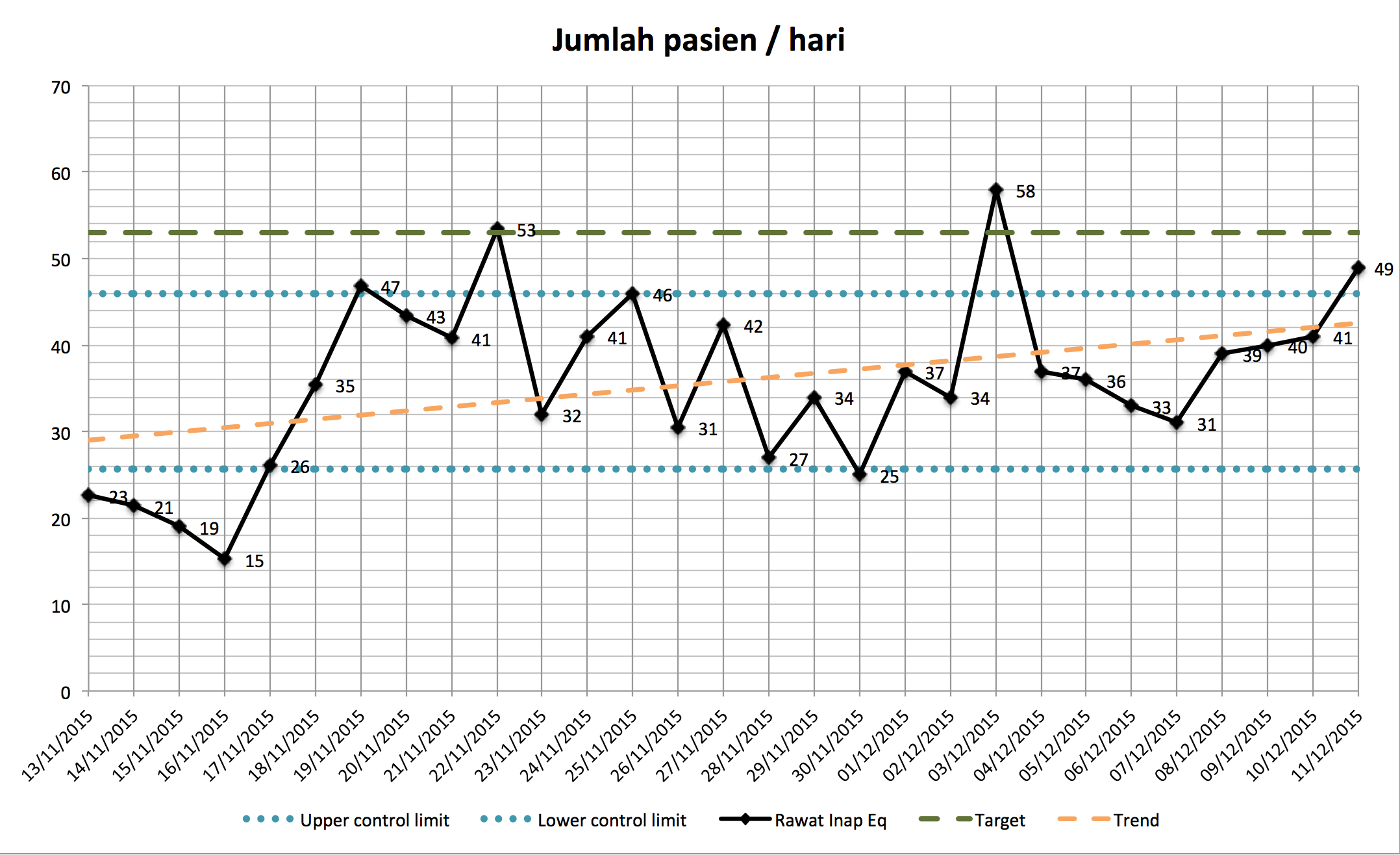
- We have plenty of data point, one per day, counting something (really the number of patients per day but it can be anything). This is displayed in a diagram like the one above.
- After 2 months this starts to get out of hand looking at and really we’re only interested in the last 30 days
- Sometimes though it could be fun to see more data in one view
Basically we want the diagram to dynamically show the last 30 days (or any other number of days we fancy). Like a 30-day window backwards.
This post describes how to do that.
DISCLAIMER I have, for some stupid reason, a Swedish Excel installed. I have translated the formulas but some other names (like menus etc) might be off. Please bear with me.
First create a new workbook with a sheet named NoPatients in it. In my real-life case we have quite a lot of data points, but to keep it simple I narrow it down to two.
My Excel sheet can be be downloaded here.
Here’s some example data for you if you want to build it yourself:
| Date | Patients per day |
|---|---|
| 01/10/2015 | 23 |
| 02/10/2015 | 21 |
| 03/10/2015 | 19 |
| 04/10/2015 | 15 |
| 05/10/2015 | 26 |
| 06/10/2015 | 35 |
| 07/10/2015 | 47 |
| 08/10/2015 | 43 |
| 09/10/2015 | 41 |
| 10/10/2015 | 53 |
| 11/10/2015 | 32 |
| 12/10/2015 | 41 |
| 13/10/2015 | 46 |
| 14/10/2015 | 31 |
| 15/10/2015 | 42 |
| 16/10/2015 | 27 |
| 17/10/2015 | 34 |
| 18/10/2015 | 25 |
| 19/10/2015 | 37 |
| 20/10/2015 | 34 |
| 21/10/2015 | 58 |
| 22/10/2015 | 37 |
| 23/10/2015 | 36 |
| 24/10/2015 | 33 |
| 25/10/2015 | 31 |
| 26/10/2015 | 39 |
| 27/10/2015 | 40 |
| 28/10/2015 | 41 |
| 29/10/2015 | 49 |
| 30/10/2015 | 42 |
| 31/10/2015 | 50 |
Also, imagine that this now contains the data for the last 2 years and you’ll see the use of this entire exercise better.
Define the “window”
To make this really dynamic let’s be fancy from the outset and define the number of days our window should be in another cell, in cell F2 for example:
| Latest days to show |
|---|
| 15 |
This will be cool to play with in a little while, I promise.
Defining ranges
In order to get this working will not use the data above directly but rather create a named range that will off set the data for us.
A Name, or Named range is just a variable referring to a cell or a formula that calculates a value. It’s global for the entire workbook, which will become important later.
Defining a named range is pretty easy, depending on your version of Excel:

- Click “Insert…”” and then “Names”
- Now click “Define…” and a dialog that looks something like the picture above will open.
- For name write
RecentDatesand then add this formula (I’ll explain it soon) in theRefers tobox:=OFFSET('NoPatients'!$A$1;COUNTA('NoPatients'!$A:$A)-$F$2;0;$F$2) - Click Add
- While we’re at it let’s define
RecentValueswith this formula:=OFFSET('NoPatients'!$B$1;COUNTA('NoPatients'!$B:$B)-$F$2;0;$F$2) - Click Add and OK to close the Name-dialog box. We don’t have to go back there.
Explaining the formulas
The main function we’re using in the formula is the OFFSET function. [Quite simply the function](:
returns range of cells that is a specified number of rows and columns from an initial specified range. The user can specify the size of the returned cell range.
The OFFSET function takes up to 5 parameters:
- The initial cell to start the offset from. The start point, if you like. In our case this is
'NoPatients'!$A$1, the first cell in that sheet. - The number of rows from the start (upper left) of the supplied reference (i.e. the first parameter, to the the start of the returned range. In our case this is:
COUNTA('NoPatients'!$A:$A)-$F$2. TheCOUNTAcounts the number of values, so this will return the number of rows down from the top our window should start. Using the value currently in$F$2this returns 17 for our data. Start 17 rows down, quite simply - The third parameter indicates which column in the range to get the data from. This is
0in our case since we’re using the first (and only) column - The fourth parameter is the height of the selection. The number of rows to select quite simple. In our example this is the value in
$F$2. - There’s a fifth parameter which is the width of the selection. We don’t use that meaning that it will be same width as the first parameter, one cell in our case.
Phew! That was the hardest part. I promise.
If you’re followed along with this you have now two named ranges. These doesn’t show up anywhere, expect if you open the “Define Name” dialog box again. But we will put them into good use … Now.
Creating the diagram

Let’s create a line diagram. It is a little bit strange but for some reason you have to start with some data in there first. So let’s select all the data in the A and B column and create a “Line with markers” diagram. It should look something like the diagram to the right.
Great - that produced a nice digram. But all the data. We want a rolling window of 15 days (as it says in the F2 cell). Let fix that.
Remember that our data will not come from the columns on the sheet but be served as a “window” that our offsetted named ranges will return.
Right click the diagram and select “Select Data…”. We’re now going to add the series manually using the two named range from before:
- First delete the series that is there now, created by Excel. We will not use it, since it shows all the data we selected.
- Click Add to add a new series
- In the “Name” box give the series a sensible name. I went with
No. Patients per day - Y-values is the
RecentValuesnamed ranged. You have to give that using the workbook name for some reason (tell you soon). Write it like this:='dynamicchart.xlsx'!RecentValues - Label for category (X-axis) is the Recent Dates. In our cases this is
='dynamicchart.xlsx'!RecentDates - Click OK and you should have a diagram that looks something like the one below.

When you refer to the named range we defined before you have to use the workbook (file) name. I presume this is because the name that we define is global. This also means that should you have many worksheets where you want to do this kind of dynamic diagram you need to choose the names of the named range careful. For example you might have a NoPatients_RecentDates and CustomerSatisfaction_RecentDates which we do.
Playing around
This is looks ok, right? Let’s play around with it and make sure that it works too:
- First change the
F2cell to 2. See how the diagram is updated - Change
F2to 31 and you’ll get the entire range. - Add a line below and see that the first data point is “rolled out of our window”
- Remove the row you just added and see that the first data point now is shown again.
- Add a trend line (right click the line and then “Add trendline”), notice how that trend is affected by the data that is shown, as you change the
F2value or add / remove data. Pretty sweet.
Summary
Using this technique can be very hand for a long list of data. Imagine that we track the number of patients for 18 months. We can still show a rolling window of the last 30 days. Or simply change the value and get an overview.
I know that I will come back to this post many times. I hope you found it useful too.