I’ve been involved and coached a project with several teams during the last year. The project aims to convert a big (and important) core business system from VB6 to the .NET platform.
It’s quite a big project with about 25-40 members (depending on which phase it’s in) and so we have several different teams working in parallel during the whole project. But it’s not until lately we’ve created a board to show the status for the whole project. Mainly due to high load in other areas of work, I have to admit.
This post will be a long one. But with a lot of pictures so I hope you won’t be bored .
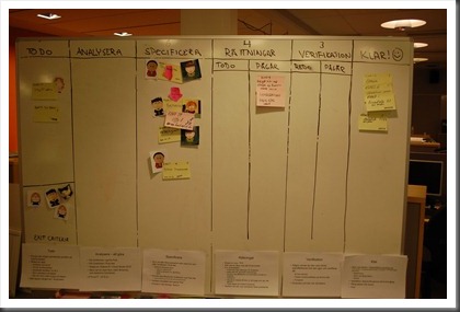
Project status board
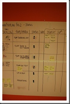
In order to easily and effortlessly communicate the status of the complete project, we have created a board on the project level that captures the status for each team. This is our first try to do this:
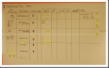
Note that we’ve started quite simply to only show the status, problems, and work in progress for each team. Later on, you probably want to be able to track resources to spot queues and bottlenecks building up easier.
Here are some details on some of the visualizations we’ve used.
Status per team
Each team is communicating their status by the use of three visualizations:
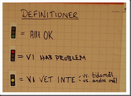
- A traffic light (Red, Green, Yellow) that answers the question: “Do we think that we will make our deadline?”
- To the far left, they also show the number of items left in their respective backlog.
- For each team, there’s also noted their deadlines and other important dates to work against.
- Finally, on the right of the board, there’s a section for any problems.
So with this, there are several ways to quickly get the status of the project. The easiest is just to scan the traffic lights, which gives you a feel for how we’re doing.
Other project level information visualized
We’ve also put up some other stuff to help people to understand the board and our project.
An easy example of that is the key or legend that shows how the traffic light is to be interpreted:
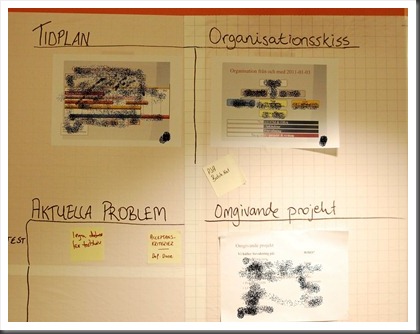
Here you can see the project overall time schedule, the organization of the project, and other projects at the company that are dependent on us (and deadlines for them):
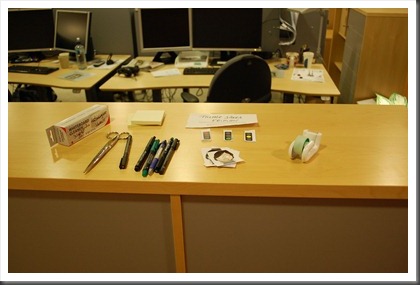
We also have all the tools needed to add or change stuff nearby:
Different teams, different backlogs, different methods
One really challenging part of taking in a project with several teams like this is that different teams work on different things, at different speeds, and with different methods.
This is manifested in “funny” (?) in the section showing the backlog where the rows for each team right now say:
- Team 1 – 18/24 backlog items left
- Team 2 – 97/97 items left + 1/1 for another little thing that doesn’t fit into their normal work (?)
- Team 3 – 6/8 items left. Each item takes about 4-8 weeks to complete though.
- Team 4 – 250/270 items to complete.
- Team 5 – No known backlog. This is a maintenance team that gets work through a mailbox. About 15 work items pass through their lane on the board each day.
So, as you probably can understand, each team has chosen different approaches. We have two Scrum projects that use sprints and well-defined backlogs for the sprint and for the whole “sub-project” (a.k.a. product backlog for the team). Here are their boards:


Phases for cross cutting concerns conversions
And we have a development team that converts a big VB6 client GUI to .NET. They work in phases for about 1-2 months each. There is no easy way to visualize their work since they are tackling crosscutting concerns through the complete system. For example:
- Create and implement a new data access strategy through the whole system
- Remove all the Visual Basic 6 references that still are left in the converted code.
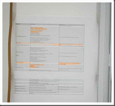
The complete backlog is just a couple of items. But they have to be done through the entire system. Here is the backlog (as it looks now):
As you can see, this team is very much an iterative approach. They are also doing things that are visible in many places – the most important to note is that this is a central task that’s not related to a team. Instead, it’s a part of the overall project, which is why it’s shown separately.
Team Kanban boards
The development teams have their own Kanban boards for visualizing their work:
Summary
With all of this in place, we are now able to get a comprehensive view of how the project is doing. We’re communicating status and problems in a concise and visual manner to our stakeholders. All teams have a way to visualize their work and how they are progressing. And, for the project team as a whole, we have some comprehensive overviews.
My personal view is that these visualizations are helpful. They really help me as a coach and project manager to understand the state of the project quickly. I hope that this post gives you some ideas for your projects and how you might be able to make your project’s status more visual and easier to follow.
Feel free to comment and ask questions!