
David J Andersson, the father of Kanban in the software community, has taught me a lot. One of the best hands-on tricks he taught me was just one sentence:
“Ask a simpler question!”
The longer version is something like: “If you find that you don’t get the answers you want, try to ask a simpler question.” This is a great tip that can be applied in many situations. In this post, I want to tell you about how I used this approach to help an entire company understand their situation and start moving towards something better (whatever that means, which I’ll also discuss).
I’ve been working with a company that is struggling financially—on the verge of collapse. Everyone “knows” this, but no action is taken, and no initiatives are coming.
The information has been sent out. The reports have been read. Speeches and explanations have been made. Even training with vital staff has been undertaken. Still, they struggle. Still, no action or awareness. People don’t seem to care that their company is about to go bankrupt and they will all end up without jobs.
This left me and my colleagues puzzled.
I sat down with a couple of colleagues (acting as consultants for this hospital) to understand why nothing was being done. We concluded that during all these years (it’s been a downhill slope for more than five years), the staff in the organization has not really understood. It was a management problem described in management terms and hence should be solved in management.

This reminds me of a scene from “The New Adventures of the Old Christine” where Christine is collecting money for an environmental charity. The other school moms don’t want to donate. So Christine asks:
“But are you not worried about the environment and the future of the planet? The future of your kids?”
The couldn’t-care-less moms respond: “Nah … the scientists will figure it out.”
The only thing is … the scientists have already figured it out. They need us all to change to make it happen.
The situation the company was facing was the same. We need more customers. Everyone knows this, but it seems like they think it is not their problem. However, we need the help of everyone to get there.
At this point, David’s words came to me: “Ask a simpler question.” So we did a single very simple diagram. It proved quite hard to produce, but once in place, it was simple to keep updated and understand.
Instead of talking about incomes and expenditures, prognosis and budget, debts, account receivable, financial costs, and operating costs (all hard to grasp and quite frankly… yawn … a bit boring), we brought it down to one single measurement:
How many customers do we need to have each day to do well?
Visualization
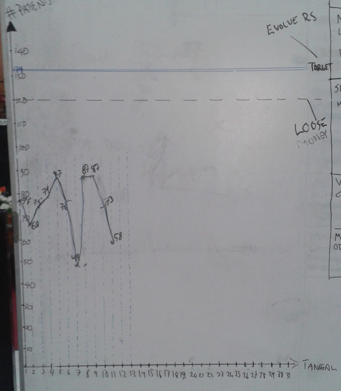
We visualized this in a BIG diagram that we update every morning in front of all the staff.
The diagram has two horizontal lines: the target we’re aiming for and the break-even point. Our explanations for these numbers are:
- If we don’t reach break-even, we are actually losing money that day. If we lose money, we cannot evolve, renovate, or improve the company. If we lose money for a long time, the company goes out of business.
- The target line is where we want to be. If we are here, or above, we can start to develop and improve the business, build new services and rooms.
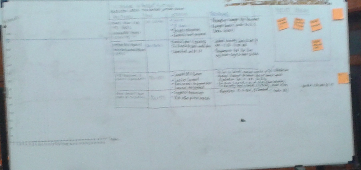
Next to that big diagram, we have a list of the three (no more than three, remember Limit WIP, people) improvement actions the company is working on right now to increase the number of customers, with status and responsible person.
For each action, we have also listed what we aim to complete by tomorrow, encouraging small steps for improvement. We have also created a section where anyone can post new ideas on how to improve the number of patients, shown to the right of this board.
Back to the question (“How many customers do we need to have each day to do well?”) and the reason for this blog post. There are a couple of parts to it:
- We’re counting the number of customers per day. This is easy to grasp and create a mental picture of. How many people walk through our doors each day?
- In reality, there are different kinds of customers, but we only show the total. The distribution is shown in a separate Excel sheet that we will show and describe to anyone interested.
- “To do well” hides a lot of details, but for the most part, you don’t need to remember what they are. This is the target we need to reach, and that’s often good enough.
- We have informed and repeated what’s included in the target (paying the staff adequate salary, covering all our costs, and making a profit) and we have a separate Excel sheet showing the details for those who want to know.
- We have converted that number into the number of customers based on the average incomes per type of customer.
We update the diagram every day, in front of everyone. Our intention is not to have big discussions but to have someone from top management stick around, answer questions, and pick up ideas.
We post Excel printouts showing the last month and the yearly trend (not yet, but they are being created). These printouts are helpful when people start to question the data (GREAT!) and for reference.
We have made some big simplifications, for example:
- Only showing total and not the distribution of different kinds of customers
- Boiling down all our finances to a single target: number of patients per day
This is intentional since we just want to create quick awareness for everyone. The details can be shown on request.
Initial Reflections
Even though it took about a week of discussions and preparations to get this in front of everyone, I could almost hear the light bulbs turn on as it was presented to the staff. Already after the first time, we had some new ideas.
This speaks to the facts very loudly to me:
- Make things visual and be transparent with the real data to get people’s attention.
- Ask simpler questions to make everyone understand. The details can be explained later.