I don’t consider myself an Excel expert user, but recently I’ve started to use it more and more and both come to like it and start doing some pretty advanced stuff with it. As always, this kind of knowledge cannot be had in a faked, training environment - for me it has to be something real to stick.
We have quite a lot of data for one of our hospitals that we can now get some pretty good trends from. But when I wanted to show only part of the trend line on a diagram showing part of the data … I ran into problems with the default, tooling suggested, ways of doing things.
I had to do it myself a little bit and try to extract some Math-skills from way back when. Luckily, I had good help around me…
In this post, I’ll show you what we did to get part of a big trend-curve to show up on a diagram showing part of the data. And how we later used that knowledge to start making some interesting prognostications.
The setup
We do daily reporting for the number of patients we serve in an Excel sheet. In order to keep this reasonable, we have created a sheet for each month. On this sheet, we show a diagram with the data for the current month.
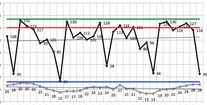
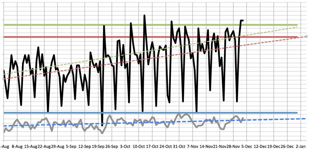
We have also created an overview sheet where we compile all the data from all the months and created an overview diagram based on the summarized data.
This works great for us saved for one thing - trends.
The problem
Because we have used the built-in trend-lines to plot the trends of our data. They are great and easy because you just right-click the series you want to add a trend line for and … Choose “Add trend line …”. We have mostly used “Linear trends”.
But now we really wanted to take part of that trend line (for say, December) and show it on the diagram for December. Because right now, of course, the trend line for December only took December data into consideration. And that was not showing the same slope nor starting points. Of course - for, for example, December we only have 3 data points right now.
The solution
The first thing we did was just trying to copy the trend line from the overview and paste it right onto December. That would have been so sweet if it worked but sadly no. I bet if Resharper did a plug-in for Excel…
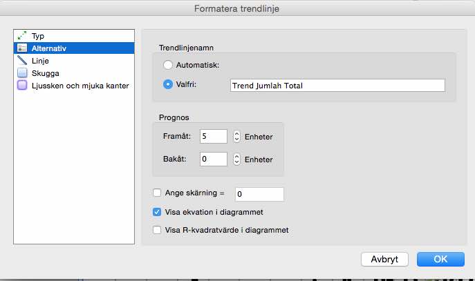
But I noticed that if you right-click a generated trend line there’s a “Format trend line…” option. In that dialog, under Options there’s a setting for “Show equation in diagram” (My dialog in Swedish, I’m afraid, here it’s under “Alternativ”).
This gave us an equation like this:
y = 0.3026x - 12592
That didn’t really tell me much but then I found a blog post that actually listed the equations for all the different trend lines. And things became a little clearer.
Let’s dive into math for a while. Don’t be scared. It will all come back to you. If I could do this so can you. The linear trend line, that we are using, has a pretty simple equation:
y = m * x + b
m = SLOPE(y, x)
b = INTERCEPT(y, x)
Let’s dissect that a bit:
yis the point on the y-axis we are looking forxis a date, a point in timemis the sloping of the trend line. This can be calculated with the SLOPE-functions. That just takes a number of known data points (y’s) for some known dates (x’s). The more data you add the more accurate is the slopingbis the point on the y-axis where it cuts the x-axis (x = 0 in other words). The INTERCEPT Excel function also takes known x’s (dates) and y’s (data points)
This means that we now have the data we need to create a trend line of our own, based on the data we feed it. In our case, we passed it all the data in our aggregate data sheet (everything we got) and hence got pretty solid values for the ‘m’ and ‘b’.
On the monthly sheets (December for example) we now created a new column for our trend line and feed our dates into the equation above. Something like this:
=('Base-data'!B6 * A2) + 'Base-data'!B7
Where the m is calculated in the ‘Base-data’-sheet in the B6 cell and the b variable is calculated to the B7-cell.
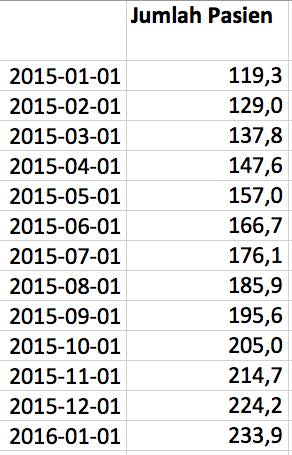
We then just dragged that out for all the dates in December. Remembering to change the cell-references to constants (=('Base-data'!$B$6 * A2) + 'Base-data'!$B$7) and it produced values like this:
It was then easy to select that data and add a Line to our diagram which showed up like this (that after some layout tweaking was orange and dotted):
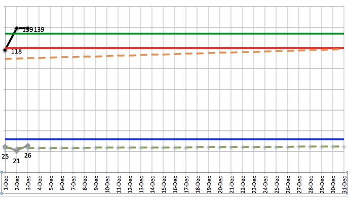
Now we had the trend curve, with the correct sloping and intersection point, calculated using our data, showing for only part of the data, the December-dates in this case.
The gain
But math is a wonderful thing. The equation: y = m * x + b is used to calculate a data point y for a given date x.
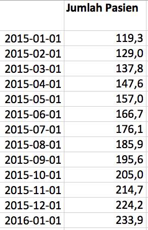
So we used that to do a prognosis. We started to feed the equation dates from the future and got a pretty good prognosis for what our patient count would be then:
We could go even further; by throwing the equation around a bit we could instead calculate an x. Here’s how that equation looks like: x = (y - b) / m. This is saying: When will we reach 150 patients a day?
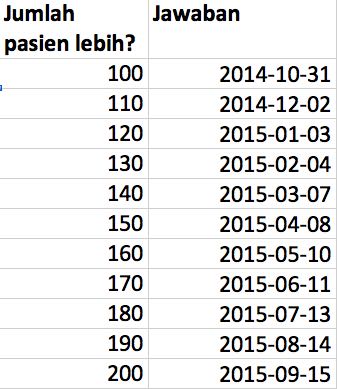
We had great fun with that and got good discussions going with our client. Of course; this only holds as long as the trend stays the same. But since we are updating the m and b as we get more data, so will the prognosis.
The summary
As I have realized many times before; use the default tooling as long as it serves you, but for detailed control, you’ll have to dive in a bit further. But when you do, the rewards can be plentiful. And useful.