One of the things that always catches my attention when I walk past a board is the colors of the stickies. Why? Because colors requests our attention and can help us in understanding more about a thing. Red is naturally a warning (in western culture at least), green feels ok, etc.
This is why I get troubled when I hear that the reason that we have chosen the colors of the stickies on our board is “because we took the ones that was closest to us”.
That is sad and I share a few thoughts on how to improve on that state of mind - it’s easy.
- Blocked is not a column
- Todo - Doing - Done is not your process
- Done? There’s no Done
- Colors speaks volumes - use them deliberately
- It’s not a kanban board if you don’t have a WIP limit
- Walk the board from right to left
- Focus on the work - not the workers
- And for the love of everything holy - please tear off the post-it’s the correct way!
colors of (not only) the stickies
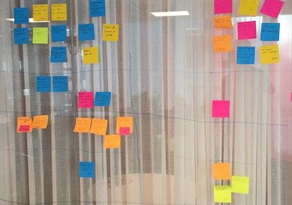
Take a look that these stickies:

The first thing that pops into my head when I see this is: Why is that one orange? How do you act differently on yellow vs blue? Blue?! Isn’t that hard to read? Etc. etc.
I make no claim to be an expert on why colors are important and how we act on them, that is a huge topic that I’m not qualified to even start to explain.
However - I know that colors on a board (not only stickies) catch my attention and makes me think about why a certain sticky has a certain color, and what I’m supposed to do with that information.
Why do I comment on this?
The reason I often come to think about this is that the colors used on a board is in most cases (Marcus-verified data) based on the distance to the pack of stickies. That is teams just pick up any of the stickies that happens to lie close to them.
So on the board above:
- Orange doesn’t mean a thing - it just what I wrote on at the time
- Blue happened to be what I had on my desktop when I wrote it
- I wrote the other on yellow so I thought I’d write this on red ones.
To my this is wasteful - colors will speak to us wether we intend to or not. For that reason we should be a little more deliberate in how we choose the colors we are using on our board.
What to fix/do instead?
This is very easy to fix on the surface - but can be used to be a little bit more advanced. I’ll explain in easiness order
Remove all colors you’re not using
This is so simple to do and helps a lot: make sure that only the colors you are using is lying around where the board is.
Seriously - do it now. Go to your board and just remove all colors but the pale yellow one (for example). Stash them far away from the board and leave piles upon pile with same colored stickies around.
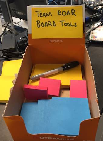
I sometimes even create a nice little box with board tools that holds these stickies (and others):

There! You have improved the easy-to-read-iness of the board with about 78,6%. All the new stickies will now be pale-yellow.
Use colors to help us to know what to do
Why is it a good idea to use different colored stickies in the first place? Because they will tell us that things are different from each other somehow - colors is a really nice way to do that.
It can also help us know how to act and behave differently with different type of work. You could say that there’s different policies for how we are going to treat work of a certain class, known as classes of service, see chapter 8 of Kanban In Action.
My recommendation is to use different colors to do just that; know what to do with the work at hand. I’ve often seen teams use different colors for work that is going to be prioritized and worked on in the same way. It either ends in confusion or that we stop using different colors.
In the great book How to measure anything Dr Hubbard says something along the lines:
Anything can be measured - but the question is if it should
He then goes on and ask great question to help to know if it’s a good idea to measure or now:
What decisions are we going to make differently based of this metric - and how
I think that’s a really good question to ask about colors on our stickies too; sure we’ll write everything from Department X on green stickies - but why? Are we going to prioritize them over other things? Are they to be handled with any special attention?
If not - I say it’s better to write them on normal color. Until we know if and how we are going to behave differently with them.
Start simple
This is related to my advice above. Start as simple as possible. I have been dong kanban for more than 6 years now and rarely met teams that truly have the need for more than 3 colors.
Typically you need only 2 colors of stickies:
- Normal - pale yellow is normal choice for this type of work. It’s also easy to use since that color is abundant and commonly present too. It’s also a very bland color, just as this is just normal attention needed.
- prioritized, expedite or urgent - red or pink is a normal choice for this work since that signals urgency (in most cultures). Make it stand out from whatever color your normal work has. It’s easy to find in most stores
There can of course be more fine-grained prioritization needed but I’ve often found that it can be handled with the order of the stickies in the columns (top more important - lower less important).
But, by all means, use as many colors you need. It’s your board. I recommend you to start with two colors and add more as you see the need. Learning new behavior takes some time. Don’t introduce more than one new color / policy at the time.
Make a legend
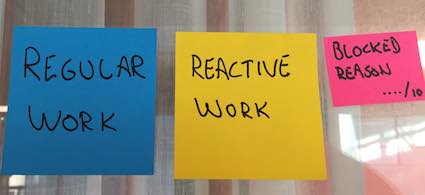
Tying into that last comment I very often found it useful to create little legend with a description of what each color mean.

(Yes - this team used different colors than I suggested above.)
It’s a quick, visual and in your face reminder of what we said about the colors and the policies.
Use the same colors that other teams are using
For extra point and clarity for other around you start to use a standard set of colors among your teams. This people that walks around from board to board can very easily understand, themselves, what is going on and what needs attention etc.
If this works most questions about a teams status can actually be answered by simply look at the board. Even very in-frequent visitors can understand the board with little or no explanation. This is further helped by the legend mentioned above.
If you need help get started there’s a set of standard stickies suggested in David Andersson’s seminal book on Kanban. We also wrote about this in Kanban In Action
Summary
colors helps us to classify and understand work better. Do better than just picking up the sticky closest to you. Use colors deliberately. It’s a quick fix that will help you and your team a lot.
If you liked this post there’s more posts on the topic below
- Blocked is not a column
- Todo - Doing - Done is not your process
- Done? There’s no Done
- Colors speaks volumes - use them deliberately
- It’s not a kanban board if you don’t have a WIP limit
- Walk the board from right to left
- Focus on the work - not the workers
- And for the love of everything holy - please tear off the post-it’s the correct way!