As an agile coach working in bigger companies you are sound exposed to JIRA. JIRA - a tool that started out as a good idea and then grew into … a not as good idea.
But hey - we got to live with it, I suppose.
</rant>
In this post I wanted to show you how to easily import data from a JIRA query to Google Sheets (or Excel I presume). That is, in all honesty, not that complicated so I will share a few other tips around this whole process.
In short:
Tweaking export of JIRA data for fun and profit
Creating a filter
JIRA has a really powerful tool in searching for issues, through it’s query language JQL. If you head on to the search feature (Issues -> Search for issues) we can try something out:
Resolution is not empty and labels in (roar-subzero-tech, wtp-unplanned)
This will return all tickets that is closed (has a Resolution) with the labels roar-subzero-tech or wtp-unplanned.
This is really cool, but very … volatile. Let’s store this query by creating a filter. Click Save as and give it a name. I named my tech-items-for-roar-subzero.
Perfect it’s is now stored and got an id so that you can get back to it via a URL, and a name. Mine go https://{serveraddress}/issues/?filter=30966
Another great thing is that this filter now have, what’s known as a canonical name; it’s like a definition if you like.
Go here and you will get all the tech items for roar-subzero
This mean that should we change the definition we just change this filter query and everyone can keep using it.
Fun fact: I actually just change that filter to this
Resolution is not empty and labels in (roar-subzero-tech)
As I understand more about how we report issues in JIRA.
With data from other filters
Now considering a case where you have many teams in an organizations; roar-subzero, roar-counters, roar-reporters, roar-core, to make a few up. What if I want to see all the resolved tech-items for all of these, but they have different definitions for what a tech item is?
Ha! This is easy: just make a filter like above and then use that in a filter of filter query like this:
filter in (tech-items-for-roar-subzero, tech-items-for-roar-counters, tech-items-for-roar-reporters, tech-items-for-roar-core)
By doing this we can easily combine filters in to build higher-order filters. The definition of what each of this mean lives in their own filter definition and can change independently for this higher order function.
I stored that as tech-items-for-roar
With the data for the last couple of days
But we can do more, since that now is a lot of items (potentially) we need to filter it down a bit.
I created yet another filter that I called tech-items-for-roar-last-month and wrote it like this:
filter in (tech-items-for-roar) and resolved > -30d
This gives me all the tech items that have been resolved across all of Roar organizations in the last 30 days.
Selecting Columns
Now, the default columns are great for reading this long list of items, but I want to do some stats. I just need the issue key, creation date, and resolution date.
To select columns, click the Columns link to the right of the search. Then select the columns you want to store for this filter. They will be saved automatically.
Setting Permissions
Always remember to set the right permissions for the filter before sharing it. Click the Details -> Edit permissions link next to the filter name and set the permissions to something useful. I usually select Any logged in user unless it’s sensitive.
Importing Data into Google Sheets
Exporting the list of issues is simple: click the Export button and select CSV (Current fields). Then right-click CSV (Current fields) and copy the link address.
Open a new tab in your browser and paste that link in the address bar. Hit enter. The file will be downloaded for you.
Because of this, we can create a link in Google Sheets to download the data.
Crunching the Data
Once you’ve imported the data into Google Sheets, you can start crunching it. I’ve prepared a sheet with some calculations.
I usually color calculated cells differently to indicate they shouldn’t be touched.
My sheet has 10 calculated columns. The first 4 calculate per row:
- Link: This creates a hyperlink back to the issue.
- Lead time in days: This calculates the lead time by subtracting the creation date from the resolution date.
- Week completed: This gets the week for the resolved date.
- Month completed: This calculates the month for the resolved date.
I’ve then aggregated the weeks and months in the following columns.
Drawing Diagrams
I’ve also created a few visualizations of the data. You can see them here.
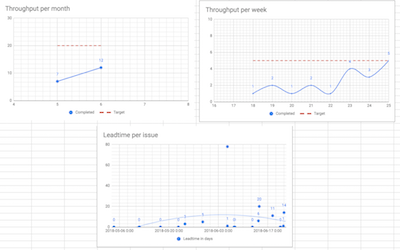
Throughput per Month
- Select the column N-P, all rows.
- Go to Insert -> Chart.
- The data range should be
N1:N1000,O1:P1000. - Move the Months to the X-axis series.
- Remove it from the Y-axis series and add it as an X-axis series.
- Select the Smooth line chart type.
- Make any additional formatting adjustments.
Throughput per Week
Same as above, but use the data from J1:L1000.
Lead time per Issue
- Select Column D (Resolved) and F (lead time in days).
- Go to Insert -> Chart.
- Select a Scatter chart.
-
Add a Polynomial trend line for the lead time in days series.
- Make any additional adjustments.
Conclusion
Here are the diagrams we created:
Consider how easy this is to keep up to date. This is literally what I do once a week:
- Open the Google spreadsheet for our stats.
- Click the link in B1 on the Instruction sheet to download a file with the raw data, based on a filter kept in JIRA.
- Import the downloaded file to the JIRA raw data sheet.
- Done.
It takes about 10 seconds. And I’m pretty sure it can be totally automated—but I’ll leave that for another post.
I hope you found this useful.