In my current job, as Head of Quality and Curriculum at </salt>, my thirst for being data-driven is frequently useful. In particular when it comes to test results for the developers in our courses. We test the developers every weekend (for 10/13 weeks) and we have now run 4 courses using the same tests… A gold mine of knowledge if you can mine it.
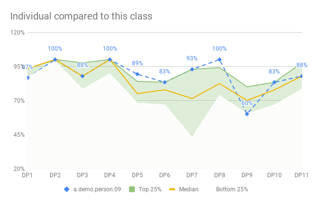
To help each developer and us, understand how they are doing we produce a diagram that compares their results to the result of their class (ca 30 people) but also compared to all classes (to date 4 x 30 people).
In the end we want to produce charts that looks like these:
But getting there has been quite tricky but oh so rewarding. At the end of this blog post, the whole thing is fully automated and kept updated. I only need to add new scores… and one extra configuration row for a new class.
Let’s go!
Percentiles for one class
To give an overview of how one developer is doing we compare their results to the rest of the class. But doing that for only the average result is not very helpful. Not even the median will help us here. We want something a little more open - like a span of results which helps us know if you are doing good.
To accomplish this, we calculate a couple of percentiles for each data point. MEDIAN is the 50% percentile meaning that if the data was sorted in size this point would be right in the middle. 50% of the data points are above and 50% below. The 90% percentile means that 10% are above and 90% are below.
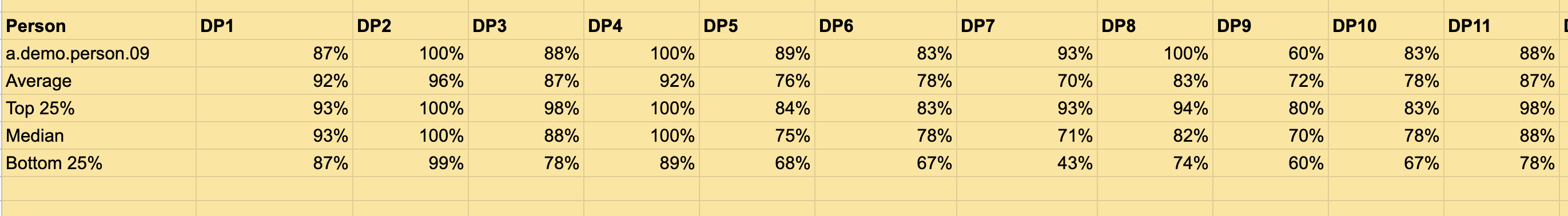
I decided to calculate 4 percentiles, per data point. In these examples the data is located in the C-column:
- Top 10% of the results
=PERCENTILE(C2:C, 0.9) - Top 25%
=PERCENTILE(C2:C, 0.75) - Median
=PERCENTILE(C2:C, 0.5) - Bottom 25%
=PERCENTILE(C2:C, 0.25)
If this is calculated per data point I can then get a line that represents each of those groups, across a chart of all data points. It’s then pretty simple to see how one person is doing compared to these groups.
Each test (aka data point) in the course has it’s own sheet and I then aggregate all of this data into on sheet with all the data points on. I’ve noticed that this is a good practice; keep the raw data on a separate sheet and then do aggregations separately.
With all that in place, I can then use the QUERY-function and get all the data structured like this:
That query is pretty simple actually:
=QUERY(TestResultAggregation!A:T, "SELECT B, C,D,E,F,G,H,I,J,K,L,M,N,O WHERE B='" &B1 &"' OR (B='Average' OR B='Top 25%' OR B='Median' OR B='Bottom 25%') ")
Get me all the data for this person (name in B2) and then all the rows named Average, Median, Top 25%, or Bottom 25%
From there it’s just a matter of selecting the data and create a line chart. It looks like this.
Much good. Much pride.
Creating the green zone
Ah, well… it’s actually crap.
It’s really hard to see and make out a difference between the individual result versus the top/bottom graphs. Not to mention the median, depending on whose score we looked at.
What would be much better would be to create some kind of zone between the top 25% and bottom 25% with the median in the middle. Then we could plot the individual developer’s result and see if she falls inside our outside the zone. It was quickly nicknamed The Green Zone.
Getting there in Google Sheets graphs is not easy and this solution is not perfect but good enough. There are solutions that produce an even better-looking, but they require coding that makes my dynamic nature of the data go away. Also - this is pretty good and only using standard features.
Here’s what I did
- Select the same data as above, all the data points for the developer, top 25%, median and bottom 25%
- I needed to check the “Switch rows/columns” to get the Data points on the X-axis
- Create a Combo chart. This chart lets us select, per series (or row of data), how we want it to be displayed
- The person series is just a blue line. Dotted with a diamond point size 7px. I also display the data label to better see the actual result
- The Median series is also visualized as a Line, that I created as orange solid 2px line
- The Top 25% series is an Area. I set the color to some kind of green and the opacity to 30%
- The Bottom 25% series is also an Area, but this time with the color White and the opacity set to 90%, which covers the colors behind it.
- I then did some final clean-ups; setting the Title of the chart and moving the legend to the bottom for example.
The result is pretty good actually.
One thing that I am not happy about, but it’s good enough, is that the lower area, in white, now covers the entire chart. The lines disappear etc, but that is ok as the individual score, in blue, still is visible on top.
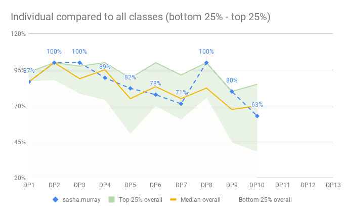
Summarizing all classes
Now we want to summarize the result of all classes - each class has a Google Sheet with their results stored in, and we need to get that data into one aggregated sheet where we can draw a chart, like the one for one class, but for all classes.
But first, let’s talk about summarizing the data. I consulted a friend and master-statistician; Dan Vacanti to ask how to summarize percentiles:
Top 10% of the top 10% of 4 classes is not really the top 10%? Should I do the average top 10% or the median top 10%
?
Dan, ever helpful, understood my question perfectly and said what I feared…
For the three classes, have you looked at combining all the data from all of the classes into one big dataset and calculating percentiles that way? That would be the thing I think I would look at first before doing averages of averages or percentiles of percentiles.
I feared it because I had no idea how to do that - but I also realized that he was right. Let’s get all the data together first and then calculate the percentiles, in the same way as for one class, but on the entire population of results.
IMPORTRANGE and QUERY to the rescue
There’s a very powerful function in Google Sheets called IMPORTRANGE that takes to parameters:
- The URL to a Google Sheet
- A range reference in that Google Sheet, for example, “TestDataAggregation!B2:O38”
It’s quite amazing because that function will now go out to the reference Google Sheet and import this range into the cell where you enter the formula. With =IMPORTRANGE("http://https://docs.google.com/spreadsheets/d/[id here]", "TestDataAggregation!B2:O38") in cell B1 we will get all that data imported.
I knew about IMPORTRANGE since before and I also knew about the powerhouse of a function called QUERY. QUERY takes a range of cells and then a SQL-statement. It’s crazy!? You can write SQL-statements on top of Google Sheets. I’ve used this a lot, for example in my Kanban Stats board, described in some blog posts.
But what I found out yesterday was how Google Sheet lets you combine ranges. Because I now had 4 sheets with data for each class that I wanted to, not only IMPORTRANGE but also combine into one big range. And clean up a bit, as we have some summary rows in the middle of the data (i.e. MEDIAN result per mob).
To my surprise and joy, this can be accomplished in one formula.
First, combining ranges can be done using the following syntax ={Range1;Range2;Range3}. This will create one big range with all the rows of Range1, Range2 and Range3 on top of each other. With 3 columns and 3 rows in each range, the result will have 3 columns and 9 rows. The ranges you combine need to have the same number of columns.
Note that ={Range1,Range2,Range3} instead will create a new result range with 9 columns and 3 rows. In this case, the number of rows needs to be the same in the ranges.
(If you, like me, couldn’t spot the difference… ; to append rows, , to append columns).
IMPORTRANGE gives us a range. And QUERY operates on a range. And now we know how to combine ranges. Which means that our resulting formula will look something like this:
=QUERY(
    {
        IMPORTRANGE(URL1, "TestDataAggregation!B2:O38");
        IMPORTRANGE(URL2, "TestDataAggregation!B2:O43");
        IMPORTRANGE(URL3, "TestDataAggregation!B2:O41")
    },
    "SELECT Col1 WHERE Col1 <> 'Mob average' AND Col1 <> 'Mob Average'"
)
I’ve formatted this for readability (pro tip: this can be entered like this using copy and paste). Let’s walk through it slowly:
- The QUERY function takes a range and a query statement
- The range is combined into one range with the same number of columns, using the
={Range1;Range2;Range3}syntax. Notice that the column names are the sameB:Obut the row numbers are different.- Each of the ranges is imported from an external Google Sheet using IMPORTRANGE.
- I’ve left the URLs out here, but in all honesty, they are stored in a configuration sheet so the real data looks like:
=IMPORTRANGE(Config!B2, Config!D2) - The range reference needs to have the same number of columns or an error will be thrown, but as noted we have a different number of rows in each reference. Different number of developers in each class
- I’ve left the URLs out here, but in all honesty, they are stored in a configuration sheet so the real data looks like:
- Each of the ranges is imported from an external Google Sheet using IMPORTRANGE.
- The QUERY has a few interesting attributes
- Since IMPORTRANGE might get its data from different named columns we need to use the
Col1, Col2, Col3syntax. This is highlighting the only drawback I’ve noticed with the QUERY-function; reordering the columns will mess up queries. - I then filter out all rows where
Col1(where the name of the developer or the string ‘Mob Average’ is stored) is'Mob average'orMob Average… Spelling and casing - gets me every time.
- Since IMPORTRANGE might get its data from different named columns we need to use the
- The range is combined into one range with the same number of columns, using the
And that is a wrap - we now get the data from 3 different sheets combined into one big range.
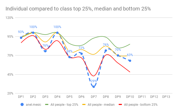
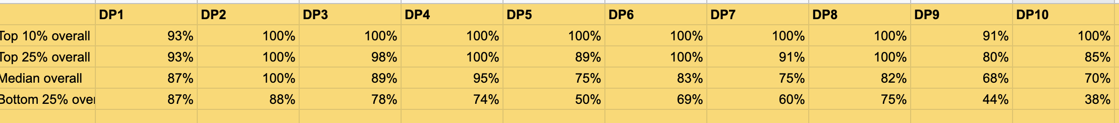
Calculating and charting the entire population
From here it’s quite simple and similar to summarize for one class the PERCENTILE per data point: =PERCENTILE(B2:B, 0.25) to get the 25% percentile, for example. I calculated the top 10%, top 25%, 50% (median) and bottom 25% percentiles, per data point for the entire population.
This gave me a table that looked like this:
With that in place, it was quite simple and the identical process of creating a chart with the green zone, for the entire population. Very much what we did above for the individual compared to the class. I will not repeat it here, as this blog post is get too long already.
Instead…
Conclusion
This is actually really cool, because now the data is kept updated as we go. We only enter new data points when we run a test in a class and then all of the calculations are made for us.
I learned a lot in this process; how to calculate percentiles of big(-ish) data sets - don’t use aggregations of aggregations but rather go back to the raw data.
I’ve also learned how to create a chart that has a zone between two lines, to show a span of data. This has proven very useful for the conversations with the developers.
And I learned how to combine ranges using ={Range;Range} and then run a QUERY on the combined result.
I hope you got something out of this too.