I have a big project ahead here at Salt - I’m going to write an entire boot camp from scratch. This is done as a single-person project and all my other colleagues are working on as normal around me.
I wanted to report my progress to them so that they know what’s happening and also that I can get some leeway of keeping my focus.
In this post, I wanted to share a very simple prognosis tool that I created based on the data that my work create. As always, it’s not perfect but it will give an accurate enough feel for where I am and when it will be done
A few words about the project
Unlike most software development projects I’ve been in the scope of this project is very clear;
- I’m going to write slides, labs, and instructions for 13 weeks, 5 days a week
- The topic is given
- The content on heading level per week is given (after some initial vetting work with external consultants).
So … all that is left is to fill out the blank. Well, it’s not that simple, but I have to ensure that I managed to fit the content.
What I did is that I listed all days (and weeks) for the entire boot camp and then created a status for each day:
- Documentation initialized
- Heading of the week created
- Heading of days created
- Content stubbed out
- Slides written
- Lab/test written
- Ready to go
I also added one more property per day: completion in 15%. I use this to indicate how much work is left to do on the day. Stubbing out the content for the day takes a very short time. While writing slides or the labs take considerably longer.
With that in hand, I was ready to create some reporting
Simple reporting
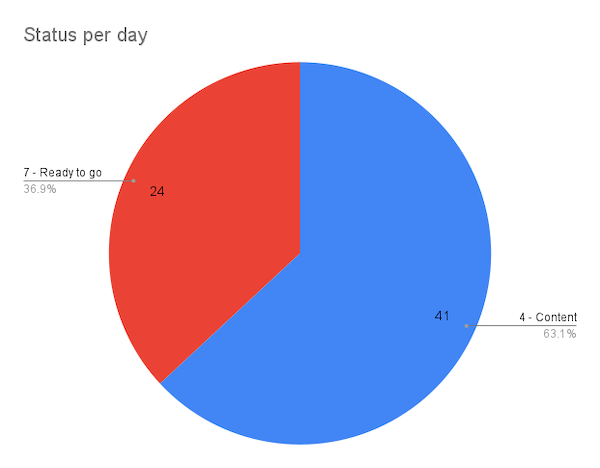
The most simple thing I could do was to add a report for how all of these numbers add up. This was things like a circle diagram showing how far I’ve come
Or just showing per week how much has reached 100%
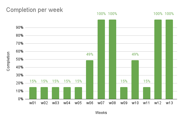
This is good and probably interesting but doesn’t say anything about when I will be done. The works I’ve done so far is the easy part. I could copy just about everything from other sources.
But let’s try to fix that - time to get prognosticate (no .. that is not right… time to make a data-driven prognosis)
Prognosis
Here’s the thing, I do know, how far I’ve come right now. And after each day I work, I know how far I’ve come so far.
For example, here’s the data for my first couple of sessions:
| Date | Completion % |
|---|---|
| 2021-09-10 | 15% |
| 2021-09-13 | 24% |
| 2021-09-14 | 25% |
| 2021-09-16 | 27% |
| 2021-09-18 | 27% |
| 2021-09-22 | 33% |
| 2021-09-26 | 46% |
Now, what if I could create a prognosis based on that data.
I first calculated how far I came per day in each session:
| Date | Completion % | Days | Gain in % | Gain in % per day |
|---|---|---|---|---|
| 2021-09-10 | 15% | |||
| 2021-09-13 | 24% | 4 | 9% | 2.25% |
| 2021-09-14 | 25% | 2 | 1% | 0.50% |
| 2021-09-16 | 27% | 3 | 2% | 0.67% |
| 2021-09-18 | 27% | 3 | 0% | 0.00% |
| 2021-09-22 | 33% | 5 | 6% | 1.20% |
| 2021-09-26 | 46% | 5 | 13% | 2.60% |
It was some simple Google Sheet calculations, required, to calculate those 3 columns:
Days
=IF(A3<>"",Days(A3,A2)+1, "")

Gain in %
=IF(A3<>"", B3-B2, "")

Gain in % per day
=IF(A3<>"",D3/C3,"")
Perfect - now let’s create some prognosis.
Each day I progress a few %. Some sessions it’s more and others less. Sometimes I don’t get time to work on this for quite some time and others it’s a few days after each other.
I’m gonna use PERCENTILE for that and call the lowest 25% my worst case, 50% my probable, and the top 75% my best-case scenario.
| Projection - Bottom 25% gain / day (G) | Projection - Median gain / day (H) | Projection - Best 75% / day (I) |
|---|---|---|
| 0.54% | 0.93% | 1.99% |
The formula uses the Gain in % per day column like this
Worst case
=PERCENTILE($E$2:$E, 0.25)

Probable
=PERCENTILE($E$2:$E, 0.5)

Best case
=PERCENTILE($E$2:$E, 0.75)
I then create a long list of dates, going from the first time I worked on the project and 6 months into the future. For each date I added four columns like below, and incremented the 3 first with the values I calculated with the percentiles above:
| Date (L) | Worst case (M) | Probable (N) | Best case (O) | Actual (P) |
|---|---|---|---|---|
| 2021-09-10 | 15.0% | 15.0% | 15.0% | 15.0% |
| 2021-09-11 | 15.5% | 15.9% | 17.0% | 15.0% |
| 2021-09-12 | 16.1% | 16.9% | 19.0% | 15.0% |
(I also started at 15% as I didn’t have any data before that)
That means that the second rows formula looks like this:
=IF(M2+$G$2>1,1,M2+$G$2)
Take the value from the G2-cell and add it to the value of the row above: 15% + 0.54% = 15.54%. For the probable and best scenarios, I did the same thing but using those percentiles.
The final column is the actual value, where I used my original data, which I based the prognosis on. It shows what actually happened and makes a nice little addition to the prognosis to see where we are today.
But I don’t have all the dates in that list so I will use the latest value I have until a new is discovered:
=IF(COUNTIF($A$2:$A, L3) > 0, VLOOKUP(L3, $A$2:$B, 2, TRUE), P2)
Where:
$A$2:$Acontains the dates where I made some work$A$2:$Acontains the percent of completion when I made some workL3contains the date for this row
After filling out all the days six months worth of data was easy and I could then create the following graph:
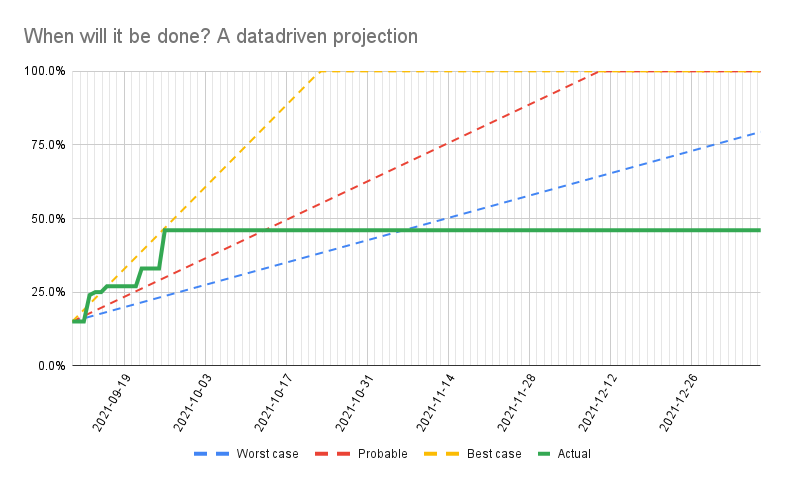
Summary and future
The projections are based on the data that I have created so far and hence this graph will be updated as we go. This is exactly what I wanted because it reflects what has happened. Just like a good weather prognosis, we update it as we get more data.
For example, let’s say that I get two days worth of working this week (at the time of writing) and I get a few percent done each day:
| Date | Completion % | Days | Gain in % | Gain in % per day |
|---|---|---|---|---|
| 2021-10-14 | 48% | 19 | 2% | 0.11% |
| 2021-10-15 | 49% | 2 | 1% | 0.50% |
That will make both the actual line and the projections change into this…
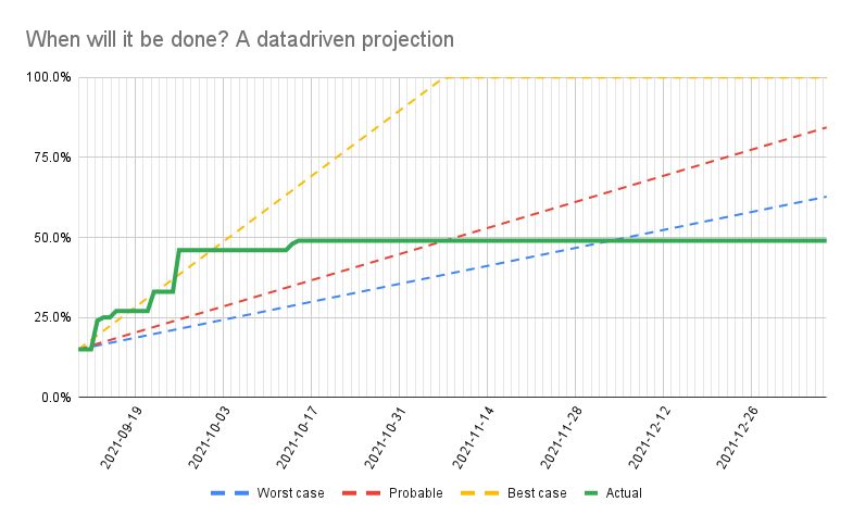
And I’m in trouble, but I can explain that I need more time. And I will have a nice way to communicate with my colleagues about how things are going and when I will be done