My good friend and co-writer Joakim Sundén has taught me a great deal about agile, lean, and a whole bunch of other things too. One thing that he said, early in my journey, that I didn’t fully believe was:
It’s always interesting to see the spontaneous discussions that appear around a kanban board (or other visualization)… after the meeting.
So Joakim says that just by having a visualization in place discussions arise. For example, after the daily standup around the board, people linger and discuss the state of the board, about improvements or other work-related things.
Have you experienced that? I have. Often. Very often, in fact. But not always. In this post, I’ll outline a few things that in my experience make these conversations happen more frequently and some words on how to harvest this nugget of information making.
(The reference in the title is, of course, from Field of Dreams with Kevin Costner)
Make it Visual
The first thing is pretty obvious … and not. If you want people to notice, understand, and act on important information - make it visual.
An excel list is much harder to digest and interpret than a board with cards in different columns. Or a diagram showing a visual representation of the data.

Consider the picture, from our book, next to this paragraph. Consider the amount of status, problems, and information that this picture tells you. And we have not even written what the cards are about, they are just empty.
Make it In Your Face
 By Arthur, used under Creative Commons
Another thing that I’ve found invaluable is to make the information as apparent as possible. Put it on the wall or leave the big whiteboard out all the time. Boards and other visualizations that are rolled out or where you have to start a projector or pull down a screen are soon forgotten and the information grows stale and unused.
Make it Big
 By Tambako The Jaguar, used under Creative Commons
This is related to the point above but something that I’ve often found overlooked. Hence important information is overlooked and disregarded, which leads to less learning and fewer improvements.
Make it Easy to Change
This is crucial for the “live” feeling of the data. Make your visualization in a way that is easy to change. And that feels like it’s supposed to change. If it looks really slick and professional, printed on a 100x70 cardboard glossy paper - it is not supposed to change. This is something that we put out in the lobby to show people. Not work with.
Make it Easy
If you want people to react (possibly even change their behavior), you first need them to understand. Trying to simplify and aggregate the information to only show the most important things has proven very useful for me when it comes to getting people to understand.
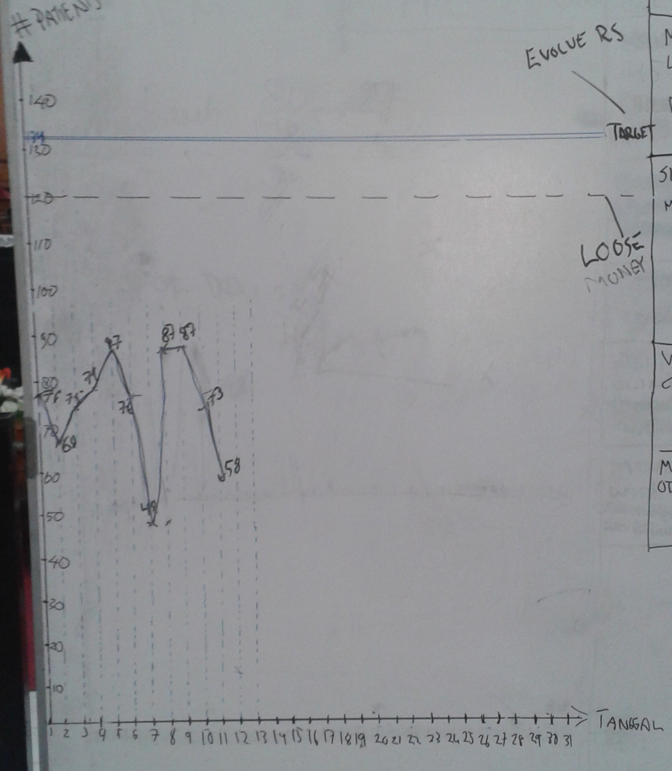
The latest experience I have around this is a great example of what I mean. We created a diagram that we wanted all the staff to know about. It’s about how many customers that we serve each day at this company and what our target is.
However, to our surprise, no one seemed to react to it. We were well below target, and we explained the consequences (not making money - no sustainable company - no work for any of us), but still no reaction.
Just on a whiff, I added a new line on the diagram; the “every day below this we’re losing money” line. And renamed the target line to “here we can evolve our company from the profit we’re making”. And all of a sudden, eyes were opened. Conversations were had. Questions about our measuring methods and data were asked. In short - people cared. Because they understood the information before them.
Ok - they get it. Now what?
If they “finally” get it, how can you support the ownership and further improvement efforts made from seeing the visualization? Here are a few, very simple, tips that I’ve seen work a number of times.
Give Them the Pen
This is so hard to do. Especially for me. Quite frankly, I think I get a +10 IQ boost when I hold a whiteboard pen… But it’s also simple; Don’t draw yourself! Give the pen to someone else.
Something that you have drawn yourself feels like yours. There’s an immediate feeling of ownership and responsibility that is quite different from the things you have “printed yourself, from Excel”. So give the pen to someone in the team. Better yet - pass it around.
Change it … or Let Them Change it
Another thing that is really important for the sense of ownership is to let them change and improve the visualization. This is not for reporting to high managers really (although it can be used for that too).
This is a team tool that we use to work more effectively together. Let’s change it so that we can do that. Let the tool evolve too.
Make sure that you encourage to change it. If someone (anyone) asks, just tell them to go ahead. I always take photos of the changes the board goes through (even data) so we can always go back to the previous design if needed.
If you’re really sneaky, you can ask them; “Why do you want to do that change? What will be better?” to make them reflect before they act. But that’s coaching ninja-level.
Walk Away … and Stick Around
This is the advice that the whole blog post started with. Once you have explained the current status of today, don’t linger around too long. Just tell the status (remembering that this is not good or bad news - it’s just news that we can act on to improve) and then walk to the back of the room.
But stay there.
Now… if you have made the visualization visual (duh!), big, easy, and the team has taken ownership of it… something magical will happen. People will start to cooperate towards a common improved future.
Not every time, maybe not every day, but often enough that I dare promise you that this will happen.
It seems like if you give awesome people a goal that they buy into they will do awesome things to try to reach that goal.
UPDATED: Here’s a short movie taken ca 30 seconds after we ended the morning meeting 2014-11-04. Just listen to the conversations, explanations, questions, and clarifications taking place. This is learning.
From your position in the back of the room, you should be supporting, observing, taking notes, and asking questions:
- Who’s talking?
- Who is quiet?
- What are being said?
- Do we dare to change the visualization?
- Do we know WHY we change the visualization?
- For suggested actions ask things like:
- Great idea - what is the smallest thing we can try to validate if that is helping us or not?
- Awesome - how can we do more of that?
- I like that - tell me again how we’re reaching the goal by that action?