UPDATE I have learned new stuff. There are a better ways. Find the update here
This is the second post in my series where I show how you can get make powerful visualizations of process data. As before, my goal here is that you can dump your process data into one tab of my sheet and then the dashboard will make all the other calculations.
In the first post, I talked at some length about other goals of this tool and some of the principles I built these ideas on.
Speaking of those principles; in this post, I will violate one of them a bit, by adding a filter capability to the lead time chart, so that we can see just a part of the data.
The reason I want to do this is that, as it the chart stands now, it’s a bit too noisy and has a lot of outliers, for example.
The reason this is violating the principle is that I’ve yet to start filtering data out without running into problems. First, we can filter out some reasonable outliers (for example, everything with a lead time above 300 days…) and that might be good. But then we see new outliers and want to take them out as well. Before long someone (probably ourselves) will ask: “That chart is nice now, but it’s not showing all the data”.
This filter is a tool and needs to be used with care. With great powers yada yada yada.
Also, I’m going to add this filtering-capability, so that we can filter on other things that might be useful; like the type of work or tags etc.
Setting it up
Just for clarity, I will do this as a separate tab calculating lead times “Lead times with filters”. I created it by making a duplicate of the “Lead time calculations”-tab. I kept the chart (that got copied) that is already showing the data in a nice way, but I changed the title to “Filtered lead times” to know what was what.
To get some more data to filter on I added a new column, copying over the “Size”-column from the “Raw data”-tab.
What are we trying to do here
The goal of all of this is to make a few lead time charts, like the one in the previous post:
- Lead times for all items we estimated to S
- Lead times for all items we estimated to M
- Lead times for all items we estimated to L
- Lead times for all with a lead time below 300
We want to do this without having to copy the data too many times, by using filtered views.
Basic filtering
Like any good spreadsheet application Google Sheets have a filter-view. I added it by clicking Data ->Create filter menu option.
What is really cool is that by filtering the data, the chart automatically gets updated. Try it out, by selecting only the items marked as “S” in size. There! Did you notice the dialog box at the bottom of the screen?
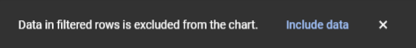
Perfect! Google sheets now helped us to filter stuff.
Caveat about fake data
My chart was not vastly improved though since the spread is still around. That was mainly due to the fact that I faked all the estimates.
However, remember that estimates are just that; how big *we thought it would be before we started to work with the item*. The chart is now, correctly, showing all the items that we estimated to S before we started. The data is showing us how long it really took.
Filter and our functions
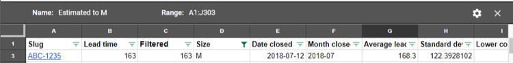
But there’s a problem here. See that “Average lead time”-column? It calculates the average lead times for all the items with the same month as the current rows month, using this formula: =AVERAGEIF(E:E, E2, B:B)
When we apply the filter for only items estimated to S… the average is the same. That calculation is not respecting the filtering.
To fix this we need to do some hacking. First, we are going to use the SUBTOTAL-function, but not as initially, one would think.
The SUBTOTAL has a way to calculate sums and averages for but we are going to use a hack to very simply just see if a row is visible or not. Because then we can reuse this information for all the averages and standard deviation calculations.
Add a new column C, right after the “Lead time”-column and call it “Filtered”. Add this formula and fill the column down =SUBTOTAL(109, B2). This function will do a SUM on all visible rows for the range B2. Huh? That’s only one row. That’s no sum.
No, but the result of that formula is 0 when the line is filtered out. We can use this. For example; let’s update the average lead time calculation from =AVERAGEIF(F:F, F2, B:B)” to this =AVERAGEIFS(B:B, F:F, F2, C:C, ">0").
We are doing an average for rows matching two criteria: F (Year-month) matches this row F-value AND then we check if the C column is above 0. If you update this formula for all the rows you will soon see that all of the values are the same.
(I actually had a problem since some of the lead times I had was 0 already, but I´m going to let that one slip).
Now, add that filtering again; show only items that we have estimated to S before we started to work with them. BOM! The average is now calculated with only the visible values.
Let’s repeat it for the standard deviation to create this formula: =STDEV(Filter(B:B, F:F=F2, C:C>0)), which in the same manner uses only the rows where column C is above 0.
PERFECT!
Filter views
Or is it?
The problem with the “simple” filter is that it needs to be changed manually. So, if you want to see the items estimated to “M” instead, you have to select “M” in that drop down. The chart updates to reflect that those changes. You can show the one or the other but not both views at the same time.
Unless… you use Views. Ordinary and stationary views.
First of all – remove the filter we just applied by clicking Data-> Turn off the filter. We are going to use something better; a filtered view.
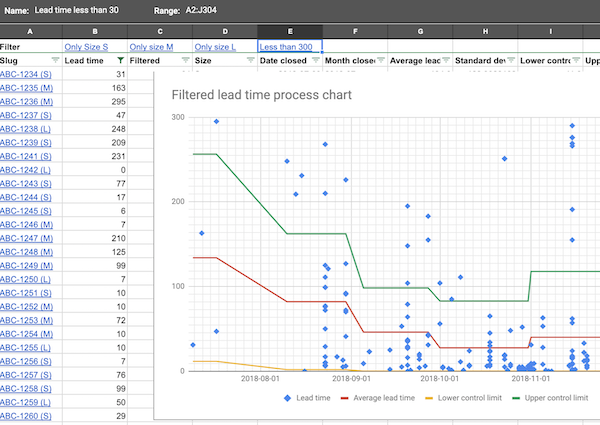
Go to Data -> Filter views -> Create new view. This will display a ribbon on top and give you the opportunity to select the range (we want all) and give it a name.
Set the filter for Size to M (in this case), give the view a name (“Estimated to M”) in this case and see how the chart updates to reflect that new value.
Repeat to create two more views for Estimated to S and L.
Finally, create one more filter setting the Lead time filter to a condition “Less than or equal to” and I gave it the arbitrary value 300.
Fine! We now have a few views. Let’s visualize them.
Making filtered charts
Hmmm … this did not turn out how I hoped and thought. Got some very useful hints from Joey Spooner about how we could make a query (using the QUERY-function, which is super powerful), and from that make a new export. Like a view of the view.
While that works fine it becomes pretty messy to setup (way beyond the scope of this post, at least) and also means that I need to replicate the view filtering. One of the things that I like with views is that it’s simple AND dynamic. I can make up new filters and it will update the chart automatically.
Another tip from Joey was to make a picture out of the chart. This is very handy but static. I could totally see this being a viable solution with a script that basically just does that.
What I settled on is a very super simple and hacky solution: I’m going to make a link per filter view that will update the chart for me.
It’s not as smooth as I wanted it to be but it helps us to answer a few questions that we have when we play around with the data. Often that is what data like this is best for; helping us to understand our world a bit better, by allowing us to study the data from different angles
MMF - Marcus Manageable Filter
Ok - less philosofy and more doing.
- On the “Lead time with filter”-tab I’ve added a new filter row, A:E
- Each of the columns now holds a
HYPERLINKto the filter- The URL can be picked up by showing the filter (Data -> Filter views-> Estimated to S for example). See how the URL in the address bar changed to have a
&fvid=at the end. Select the whole address and use that as the first parameter - The name is just a name for the filter
Only Size Sfor example - The full formula will look something like
=HYPERLINK("https://docs.google.com/spreadsheets/d/1IinrY-3_wEQUwHucDgHsCMUkFhLOqlBzXkZfc1yLBBI/edit#gid=918968025&fvid=2092689969", "Only Size S")
- The URL can be picked up by showing the filter (Data -> Filter views-> Estimated to S for example). See how the URL in the address bar changed to have a
- Repeat for all views.
An user can now click one of those links and get the chart filtered.
Export as picture
I need to show to export the chart as a picture as well, because that could be handy to know, I would guess.
- Click one of those filters
- See how the chart updates
- Click the menu dots of the chart
- Select Download as picture in a suitable format.
Summary
Ok that last part was a bit disappointing. Let’s move to another simpler world in the next post where we will calculate throughput; how much gets done per time unit.
In this post we have given the user a bunch of opportunities in how to filter the data and have the charts update to reflect the filter.
The links
My sheet is open for anyone to read and, if you want to, make a copy of. If you use it and find it useful - please throw me an attribution or a nice thought. If you make something awesome out of it - please let me know so that I can learn more about this.
All the posts in the series are found through these links: