UPDATE I have learned new stuff. There are a better ways. Find the update here
Lead time is awesome to track and try to improve. In fact, it’s something that will guide you to a lot of improvements and should be front-and-centre of your process metrics.
But that says very little about how much that gets done per time unit. Doing one thing in a day, fast and with quality, and then nothing for the rest of the month means that no other things get done.
Let’s start to track another metric; throughput or
the amount of material or items passing through a system or process.
With the data, we have this is pretty easy to get hold of.
Setting up
Like before, the goal is to not touch the “Raw data”-tab so that our exported data can be updated in that one place and the rest will be calculated and derived from that tab.
therefore, let’s create a new tab “Throughput calculations” and do all our calculations in there.
In the end, we will move the charts we create to the “Dashboard”-tab as before.
Throughput per week and month
Let’s calculate the number of items (only items so far, no filter more than that. Yet…) of completed items per month.
Throughput is only interesting to do for things that have a “Closed date”, meaning that they are done in one way or another. I’m going to add a check for that the “Closed date” is set to get my data since that might change in the Raw data.
Throughput means some kind of aggregation of the items. We will not be interested in the items themselves. We will, hover, be interested in how many items we complete per time unit. Let’s do per week and per month.
However, “programming” in spreadsheets often leads to the more cumbersome way being the simpler. Let’s make life easier on ourselves and find all items that are closed (have a closed date) and calculate their “year week” (2018-28 for example) as well as “year month” (2019-01) for example.
We can do this with the powerful QUERY-function. It’s basically doing SQL over the data in the spreadsheet. Like this:
=QUERY('Raw data'!A:I, "SELECT A,I WHERE I IS NOT NULL ORDER BY I")
This will:
- Select columns A (Id) and I (Closed date)
- but only for the rows where Closed date is not empty. I.e. has a closed date
- Finally sorting it on the Closed date ascending.
Pretty slick, huh?
We can now very simply get the unique weeks (Col D) and months (Col C) using the UNIQUE-formula like this: =UNIQUE(C2:C) and we can even sort them while we are at it: =SORT(UNIQUE(C2:C), 1, TRUE). Those last parameters actually default so =SORT(UNIQUE(C2:C)) works equally well.
I put the unique months in column F and the unique weeks in column H, for now.
Appreciation break
Let me just stop and appreciate the amazing Google Sheet for awhile. Many things in the application are mind-blowing but right now I wanted to send a special love for the C2:C syntax.
Take all rows in the C-column, starting on row 2. You can’t do that in Excel. I love that. Without it, I would either get the heading or update this formula every time new rows are added.
Thank you, Google!
Round’em up
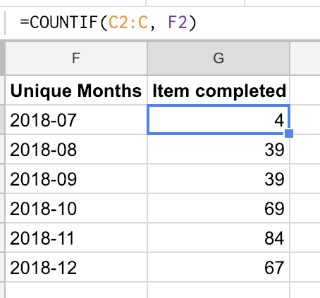
It’s now, thanks to the copying of all the rows in columns A:D, pretty easy to count the number of items finished per month: =COUNTIF(C2:C, F2)
Add that formula in column F and you will have something that looks like this:
Repeat for the weeks and we are ready to visualize this.
Make a chart, make a chart, make a chart
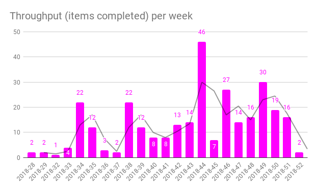
This chart is pretty easy to make. I kind of like the line charts, but here’s a time where a column chart might work too. Either way, select the Unique months in column F and the count of items completed in column G and you are more or less set.
I added a moving average trend line too, for good measures. We are measuring for learning and looking at trends is a good way to do that.
Here’s how my “completed per week”-diagram looks.
Extra points
Pretty soon you’d want to filter this data as well… I will leave this as an exercise for you. But you should probably start by including the data that you want to filter on in the QUERY-formula we used in the beginning.
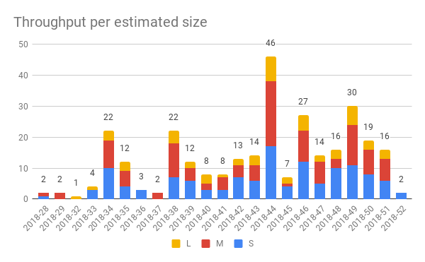
But just to whet your appetite, here’s a chart showing the throughput per week and estimated size.
Summary
There! A nice and quick throughput visualization.
Pretty happy how this turned out, the only thing is that I now realized that I need to update the lead time sheets too so that I only include the completed items. I’ll make an update to that post about that.
In the next post, we will do something more advanced and start to measure the queue lengths. It will probably be two posts since we need to update the raw data with items that are not finished.
The links
My sheet is open for anyone to read and, if you want to, make a copy of. If you use it and find it useful - please throw me an attribution or a nice thought. If you make something awesome out of it - please let me know so that I can learn more about this.
All the posts in the series are found through these links: