UPDATE I have learned new stuff. There are a better ways. Find the update here
I have been coaching agile teams for about 15 years now. One thing that I often help teams that I coach is to tap their process of some valuable data. It turns out that many of the tools that we are using have a lot of data in them that we seldom look at and even more seldom act on.
Most of these tools (like JIRA or Team Foundation server) obviously have ways of looking that this data too, but I’ve found that it’s either really hard to understand the visualizations or that the reports that you can produce simply don’t cut along the right axis.
I’ve now grown tired of recreating these simple reports for every client and wanted to share my, very simple, stats here. This way I can reuse it for future clients and also maintain it in one place. The goal is simplicity – so I’ve put it on Google Sheets to be shareable. For the integration, between the dashboard and the different source systems, the goal is that you should be able to just paste in some data, in a certain simple format, in one tab (conveniently called “Raw data”) and then the dashboard will do all the other calculations.
I want to share 4 very simple metrics that are easy to get from a very simple export of all the items, that you are interested in, and then makes some useful and simple visualizations from it. The metrics are:
- Lead time – the mother of all lean metrics. How long does it take for each item from “Could you please” until “Thank you very much”, from start to al. Many good things follows from trying to lower lead time, such as more flexibility, faster feedback, smaller risk etc.
- Throughput – how much stuff do we get done per time unit, items completed per week for example. This gives us some way of starting to be transparent about our predictability.
- Work in process – how much stuff is going on right now? This is useful to show both the current workload but can also be used to measure the length of backlogs and waiting times.
- Blocked work – how much work is being held up by something (that is not us). Resolving blocked work is one of the best ways of improving (and lowering lead times).
This will have to be a series of blog posts as I want to dive deeper into each topic to ensure that we understand it and how to use the data.
These are not the metrics you are looking for…
Before someone interrupts me I want to be the first one to point out that all of these metrics are what is known as proxy variables. Meaning; these metrics do not show the real value we are after, but rather is a proxy for that real value.
If we have a super low lead time in completing work that no one is interested in, for example, it’s not very useful.
The metrics suggested is easy to get hold of and can be useful to look at to get a sense of how our process behaves. But beware of making these values the goal. The goal is to create value for someone that matters (quality according to Jerry Weinberg) and we should most definitely track the effect we are creating too, but that that is another blog post series…
Some principles
Here are a few principles for how I create these stats:
- We measure to learn – not to punish. Hence we are more interested in trends and their elaborations rather than individual numbers. 145 might be an acceptable lead time if the overall trend is going down.
- We value transparency over presenting a good picture. Hence I rather show all the data than trying to exclude some items just because it will make the chart look better. I’ve found only slippery slopes when trying to decide which outliers to exclude…
- Process statistics, like the ones above, should inform decisions – not be the goal in itself. Use this data to discuss around in your retrospectives or to see if your improvements ideas actually made a difference or not.
- The dashboard is just a view of the data. The real data is in the system or on the board.
- Updating stats should be easy and fast. When it takes a long time it doesn’t get done and very soon forgotten. I aim for under 1 minute/week to get these stats.
Get going already
Ok – let’s do this. In this first blog post I wanted to get started by importing the data we will need and then create a useful visualization of lead time, called process chart, or a running chart.
The sheet I’m working in can be found here. It will probably be easier for you to follow along by peeking at it. If you want to make it your own – just make a copy of the sheet.
The tabs
Let’s go through the tabs that we are using to get this dashboard working.
Raw data
The “Raw data” tab is the only tab where you will make changes, save the initial configuration. And that is just pasting in data from your electronic, or physical, kanban system. Typically you can export items from your systems. The rest of the tabs will pick up data from this tab.
Since you are exporting this data you can, in that export, decide what filters to apply and you can even automate the import of the data if you want to.
For this special tab it’s good to know the columns in details so let’s talk about those:
| Column | Description |
|---|---|
| ID | A key for the issue. Typically this is generated by an electronic system automatically. |
| Type of work | A string that indicates what type of work this item was. Typical examples are user stories, bugs and technical/intangible work |
| Size | A sizing of the work. I prefer 1 size of an item, but this could be S, M, L or story points, or what have you. We can use this to group data on later. |
| Summary | A summary is a short title or description of the work item that gives you enough information to know what it is about |
| Status | The status of the issue |
| Reason | For many systems you can add a reason or a sub status. For example, something can be in status “Closed” due to “Cannot Reproduce” or “Fixed and verified” |
| Created Date | This is the date when the issue was created or registered. This is the true starting point for the lead time when someone said “Could you please” or when we registered the issue in our system. We were made aware of the issue at this point. |
| Activated Date | This is the date when we picked the issue up onto our board and started to work with it, actively. It can be useful to have, but this data is also tricky to get hold of in some system. Leave it empty or duplicate the “Create Date” if you don’t have “Activated date” available |
| Closed Date | Closed date is the date when the issue was officially closed, regardless of reason. This when the client said “Thank you” and the end of the lead time for the issue. Some of the systems I’ve used allow for several “Closed” dates and sadly the first one is then reported here. You might want to look into how to get the latest instead. |
| Tags | A semi-colon-separated list of tags that can be used to filter the data on. Like this: “System 1; New; Back-end work” In some systems, this last column comes out in a list of columns and you might need to make it into a semi-colon-separated list first. The reason I’m using a semi-colon to separate the values is that a very common format for export is comma-separated (CSV) and that would mess this column up. |
Dashboard
The dashboard is where the dashboard visualizations will reside. It will also be some overarching aggregations.
I might add separate copies of some charts on separate tabs later, for easier viewing.
Configuration
On the configuration tab, I have stored some configuration that will be used in the calculations and visualization. It consists of a very simple table and is hopefully easy to understand.
Lead time calculations
On this tab, I have augmented the data from the “Raw data”-tab with calculations that are needed to make the lead time visualizations.
I will try to do a sheet with calculations for each of the metrics to make it modular and simple. But the raw data should stay the same.
Lead time and the process chart (running chart)
To make a running chart we will need a few calculations made. Take a peek at the “Lead time calculations” table and we’ll go through them one by one:
- Slug – a way to represent the item in a visualization. I’ve found it very useful to make a calculation of this to make it understandable. In this case, I’ve put together a hyperlink (using the URL prefix from the configuration-tab) from the key. That makes the issue clickable in listings
- Lead time – is simply the difference, in days, between the Creation date and the Closed date. The whole time it took to complete the item.
- Closed date – the date when the item was closed. It does only make sense to calculate the lead time for items that are closed and completed. This date is also used to group data points in the chart.
- Completed in Month – the year and month in which this issue was completed. We will use this information to calculate some averages per month etc
- Average lead time – this is the average of all the issues closed in the same month as the current row
- Standard deviation – the standard deviation for the all the issue closed in the same month as the item on the current row. We will use this number to calculate upper and lower control limits. In my data, the lead time distribution is very wide and hence the standard deviation gets big too. This can be handled with filters but I have not here.
- Lower control limit – well here we go; the average - one standard deviation gives a lower control limit. Meaning that ≈70% of the data points will be above this value. Through the hilariously named statistical rule; the 66-95-99.7 rule I’ve made sure this value never goes below 0 as that makes for a very strange chart.
- Upper control limit – the average + one standard deviation gives an upper control limit. Meaning that ≈70% of the data points will be below this value.
A chart! For the love of God – make a chart already
In coming blog posts, I will not go through all the information as closely as this, I think. But I thought it would be a good idea for this starter post.
Ok – the chart is thankfully a bit simpler to create, now that we have all the data. Do this:
- On the “Lead time calculations”-sheet – select column A, B, C, E and G and H. You can shift-click to do this.
- Create a “Line chart”
- Ensure that the X-axis date holds the “Closed date”-values
- For the lead time-series, click to add a label from the A-column, “Slugs”.
- Now do some customizations
- First, change the chart title to something like “Lead time chart” or “Running chart”
- Select the “Lead time” series and set the “Line thickness” to 0 px
- Select the “Lead time” series and set the “Point size” to 7 px and select a good shape
- Select the “Lead time” series and select “Custom” which will pick up our Slug. It will display the value when you hover over it. You can remove the data label if you find it cluttered. You can always enable it again later.
- Select Legend and put the legend at the bottom.
- You can fiddle around with grid lines for the axis to make it more readable, to your heart’s content.
When that is done you should have something that looks like this.
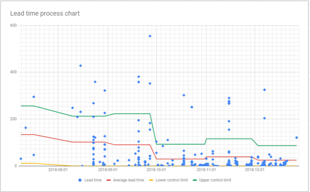
Although it looks a bit messy it’s quite a lot that we can read out of this chart:
- Each dot is an issue we finished.
- If we hover over it we will see the number and exact date for each
- We can also enable the slug to see which issue it was
- The three lines tell us about the averages (red) and the control limits.
- From this, we can use stats to say that the next value will, with 70% certainty fall within the green and yellow lines
- Clicking the lines will reveal the values of them.
- The lead time averages and control limits are calculated using the values from each month so that we can see the progression and any improvements. See how the lines keep falling?
- The average lead time is lower and the span is smaller too. We are getting more predictable. For the last month, we can see how we, with 70% certainty, will have a lead time between 0 and 87, with an average of 61. Compared to the first month of the data where we have a lead time between 11 and 256 – with an average of 39.
Summary
I think that is enough for now. We have got started. The next blog posts will be a shorter and only concern a single chart in the dashboard. In the next post – let’s make a version that allows us to do some filtering.
I wanted to create a powerful but simple tool, where the user can simply paste some data into one place and then the dashboard does the calculations needed to make better sense of the raw process data.
In this first post, we got started by creating a process running chart for lead time based on some of the raw data.
The links
My sheet is open for anyone to read and, if you want to, make a copy of. If you use it and find it useful - please throw me an attribution or a nice thought. If you make something awesome out of it - please let me know so that I can learn more about this.
All the posts in the series are found through these links: