UPDATE I have learned new stuff. There are a better ways. Find the update here
This post is all about just aggregating and averaging out to a single number… and then I can’t control myself but start to lay that number out over the individual weeks too.
That, and we will use the Gauge-chart for the first time in my life.
This is the fifth post in my series on some simple kanban board statistics. We have been talking about:
Common questions
Although I have the diagrams laid out and everything is visible one of the most common questions I get is:
But what is the overall average? How long does an S usually take?
After I explain that this is just a point-in-time-reading that will not mean much and then get forced to dig up the number somehow - after all that I usually just get an “Ah. Good to know”
So let’s answer that question by aggregating those numbers and also add the median and max which could be handy.
Query
Like before I created a new tab (“Aggregations”) and started by creating a QUERY from the data in the “Raw data”-tab. Like this
=Query('Raw data'!A:J, "select A, B, C, J, dateDiff(I, G),I where I <> G and I is not null label dateDiff(I, G) 'Lead time'")
A little bit more complicated but still not ridiculously hard:
- I
SELECTthe columns that I want to aggregate my data on Type of work, Size, Tags and ClosedDate- dateDiff(I, G)A special part of the
SELECTisdateDiff(I, G)that calculates the diff between the start and end date - i.e the lead time. Pretty handy.
- dateDiff(I, G)A special part of the
I IS NOT NULLensures that we only get the rows with a CreateDate- The
I where I <> Gin theWHERE-part is just to ensure that we get things that have a lead time greater than 0 - A the very end I’ve added a
LABELfor the lead time. It’s basically just assigning a new name for something you selected. In this case, I’ve used a function in mySELECTand the label statement becomeslabel dateDiff(I, G) 'Lead time'
Phew! Pretty advanced but still easy to understand once you break it down. I like it.
I’ve also added an additional computed column for “Year week”, as many times before, where I simply calculate the year + week number where the items were finished.
Averages
Ok with that in place the averages are pretty easy to do.
Total average
The average lead time is very simple to calculate:
=Average(E2:E)
And you’re done. The average of everything. Not very informative, because it includes the one that took 684 days as well as the one that took 1. But hey - it’s the average.
Average per estimated size
Now, this might be more interesting. What is the average of the work that was estimated to S?
To do this I first listed all our unique estimates: =UNIQUE($C$2:$C) which, for my data, gave me S, M and L.
I then created the following average-formula, to select the lead times for all the work estimated to S:
=AverageIf($C$2:$C, I4, $E$2:$E)
- Check the values in
C-column (Size) and compare them to the value inI4, that isSin this case. - For the ones that match, calculate the average from the values in
E-column (Lead time)
Simple now that our data is properly set up.
Repeat for M and L and we are done.
Average per type of work
The type of work is very much the same:
- Get the types of work with
=UNIQUE($B$2:$B) - Calculate the average for each type with
=AverageIf($B$2:B, I9, $E$2:$E)whereI9contains a type of work
Visualize it with gauges
As these values just become a single data point, in time; “Average of M is … 14.6. Now. “ - because of this we can visualize it as a single data point to.
Visualizing a single data point is not particularly interesting in itself, as it tells us nothing about the progress - but at least there’s a funky chart for that: the Gauge chart!
Select the values (and their labels) that you want to visualize and create the chart. In my case that is (I1:J10)
Bom! Done!
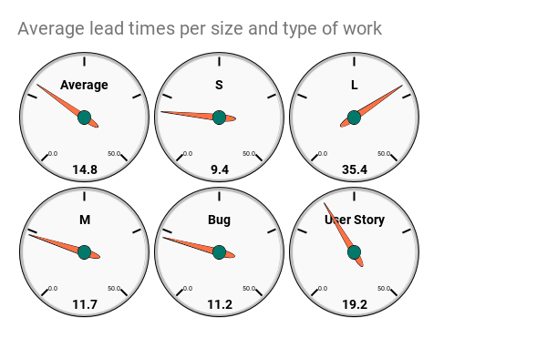
Now I can easily answer the question;
What is the average of items we estimated to S?
9.4 days, sir!
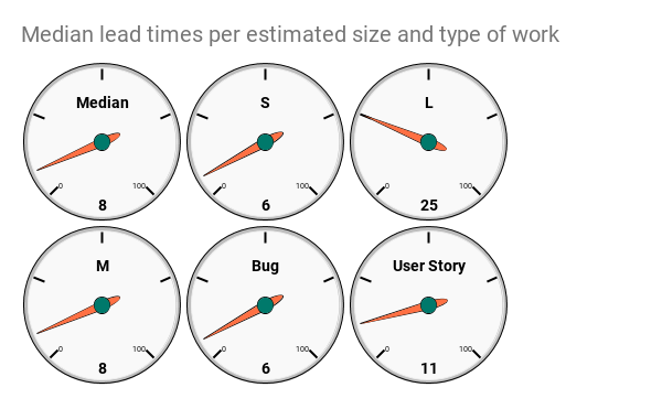
Median
The average is a metric that can be a bit misleading since the extreme outliers, also are included. I kind of like Median instead.
A very simple description of how MEDIAN works is that it takes away one from the top and one from the bottom until it reaches the middle. The Middle-value if you want.
Doing the MEDIAN calculations are very similar to the average… except in it’s not. Here’s how to do it
Total median
Yup - dead simple:
=MEDIAN(E2:E)
Median per estimated size
Now it becomes a little tricky since Median doesn’t have a MEDIANIF. So we will just the FILTER-function to do the filtering and then pass the result of the MEDIAN function. Like this:
=MEDIAN(FILTER($E$2:$E, $C$2:$C =K4 ))
K4contains the valueS- Column
Ccontains the estimated size E-column is the lead times.
This can be read as; filter all the values in column C to match K4 and then return the E-columns values. Finally, do a MEDIAN for these values.
Repeat for the other sizes
Median per type of work
Well… this is so similar to the thing above that I’m just gonna show you the formula:
=Median(FILTER($E$2:$E, $B$2:$B = K9))
K9 contains the work type Bug, for example
The gauges for medians looks like this.
Max and Count
I have also included a max and count. Just because it’s something more than I get asked from time to time.
They are exactly the same as MEDIAN and I will not waste space on describing them.
I did not make gauge charts for those too but let them just values in the sheet.
Comments on the values
Notice how the MEDIAN and AVERAGE values differ. Quite a lot in some cases. In my made-up test data the S estimated work was 9.4 on average but 6 in the median.
Hmmm… why is that? Can it teach us something? Maybe? Or maybe not…
I’m leaning to not because this is just a single value and is very hard to put in relation to other data points. Just you wait…
Per week
Much more interesting, in my opinion, is to see how this value develops and change over time.
So I made a simple list of the weeks using UNIQUE and then just calculated the aggregation values for each week.
Here’s the result:
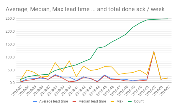
Ha! That’s better:
- See how we get a line for the total number of finished items.
- See how it develops? Why so steep in the beginning? Why flattening out in the end? What can we learn?
- We get a line for how average, median and max develops and change over time
- See the spike in both averages, median and max lead time in 2018-52? What happened there? What can we learn from that?
- Median is always lower over time, is that a math thing or does it depend on the number of issues completed? What can we learn from examining those questions?
- What if we filtered on the size and work type, or something else? What can we learn?
Summary
Aggregation to a single number is pretty interesting (HA! We closed 248 issues the last 6 months!), but I hope that I convinced you that having historical data and see how the trends for each line is developing makes it even more interesting.
The links
My sheet is open for anyone to read and, if you want to, make a copy of. If you use it and find it useful - please throw me an attribution or a nice thought. If you make something awesome out of it - please let me know so that I can learn more about this.
All the posts in the series are found through these links: