UPDATE I have learned new stuff. There are a better ways. Find the update here
It’s time to wrap this series up. I have one final thing that I want to visualize: queue length. How much stuff is waiting and how long will that take us to complete? And maybe even, “if I add something in the queue now, how long before it’s done?”
- Lead time
- Lead time with filters
- Throughput
- Where time is spent
- Single numbers - averages, median and max of lead time
As always my sheet is found here and you can make a copy of it and use it. Please let me know how it’s working out for you and if you end up doing something cooler than me.
Let’s do it - queue length!
Why queue length?
I picked up queue length as a metric from the awesome book Principles of Product Development Flow by Dr Donald Reinertsen. And since reading that book I have used this metric (queue length) many times and it’s always been revealing and interesting to see;
- From a client perspective, it will answer the “when will it be done?”-question
- From a team perspective we can track “how long will it take to complete the backlog stuff”
- And we can also track how much work in process we are taking on, which a nice proxy variable for both flow and stress.
How to get hold of that then?
Status and queue are not always the same
The first thing to take note of is that the “Raw data” from electronic systems list items/issues. They have status. Very often these statuses are then mapped to a column on a board. Pretty often the column holds items of different status. For example; both status “New” and “Registered” are listed in the “Backlog”-column.
In our export, the column names do not list and that is often the case I’ve found. So we need to make a mapping between statuses and columns. Something like this, for example:
Status (A-column) |
Column on board (B-column) |
|---|---|
| Closed | 4 - Done |
| Active | 2 - Dev |
| Resolved | 3 - Test |
| Development | 2 - Dev |
| Testing | 3 - Test |
| New | 1 - Backlog |
A nice little mapping table.
See how “2 - Dev” and “3 - Testing” is mapped to more than one status… That’s an example of what I meant by the statuses belonging to more than one column.
The status column is just a list of all the UNIQUE statuses from “Raw data”. The column names I’ve made up for now but should match how your board (physical or electronic) is structured.
By doing this mapping here we have a simple one location to update this structure.
I have included numbers in the column names, to indicate the order of the column on the board. This is good for readability in these stats but also helps the generation of the charts later.
Number of items per column
Let’s count the number of items per column - not status, mind you but these arbitrary grouping of statuses that we call “Column” in the list above.
To do that, though, we need to first get hold of the number of item per status. Let’s write a QUERY to do that:
=QUERY('Raw data'!E2:E, "SELECT E, count(E) WHERE E <> '' GROUP BY E LABEL E 'Status', count(E) 'Count of status'")
- The E column contains the statuses, I skipped the first row, obviously since it contains the header “Status”
- Counting the number of items with this status is as easy as
count(E) - I then used
GROUP BY Eto get a unique list of the statuses - And again,
LABELis a way to name the columns that are returned.
Sweet! We now have a count per status. Let’s aggregate that per column.
In order to do that we will use the VLOOKUP-function. It’s a bit messy but let’s walk through it little by little:
First - to get the name of the column per status.
=VLOOKUP(D2, $A:$B, 2, FALSE)
- First parameter (
D2) is the search key, in this case, a Status (“Active” for example) - Second parameter (
$A:$B) is the Search range, the columns to search. This is the mapping table we created before. - Third parameter (
2) is the index for the value that we want to check. In our case 2 refers to the B column, where the Column-names are stored. - The last parameter (
FALSE) indicates if the values are sorted or not. Not in our case.
So basically we are looking up the column name for each status with a count.
Ok - so now we know what column-name each column, with a count, has… now we can easily aggregate the total number of items in each column .
First I get the UNIQUE-column names and put them into column G (=SORT(UNIQUE(F2:F))). Notice how I easily can sort it too, as I gave it a number as well as a name.
The total number of items per can now be calculated by summarizing all with a certain column name:
=SUMIF(F:F, G2, E:E)
- In the
F-column, - look for value
G2(1 - Backlog, in our case) - And then summarize the values in the
E-column
Easy-peasy.
And we can now very easily make a chart that is a bit underwhelming:
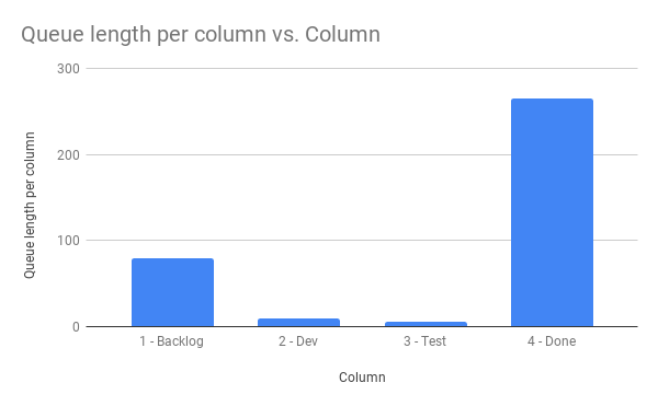
But what does that mean then?
The reason the chart is very underwhelming is that right now, we only get the number of items. It is not particularly helpful, but we can do better.
For example; let’s try to answer how long it will take us to empty the backlog if nothing new gets added.
In order to do that we are going to use the calculations about throughput that we did before and the average number of items, we complete per week. We can get that by doing the average of the “Completed per week”-column on the “Throughput calculations sheet”
=H2/AVERAGE('Throughput calculations'!I:I)
Where H2 is the `Queue length per column” for, in this case; “1 - Backlog”.
With that filled for all rows we can now say something a little bit more interesting through this diagram:
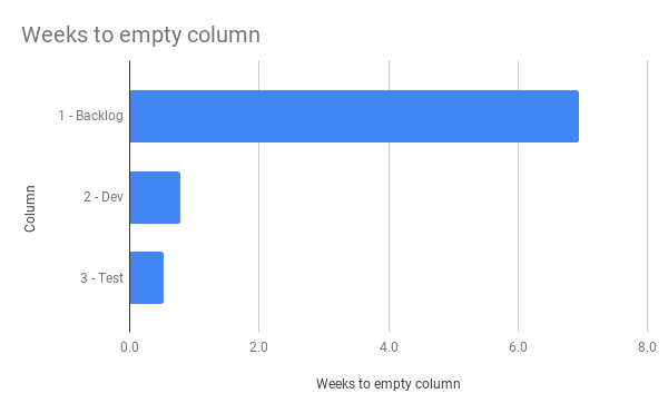
Pretty interesting and once we add all of those columns up, we get how many weeks it will take us to empty the whole board… if nothing more gets added.
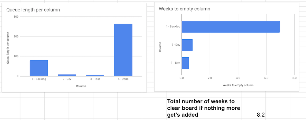
Putting these three together is actually not half-bad information:
Extensions that we could make
We could have pressed on and slice this per estimate or system or something more, but I’m going to leave that as an exercise for you. Love to hear about it, because that felt a bit tricky to me… we probably need a column/estimate calculation and then … it’s messy. And maybe not make us more enlightened in the end.
Another, much simpler, change would be to use the median-value instead of the average in the calculations above and probably get a more realistic estimate, that skipped outliers in a better way. But I’ll leave that up to you to discover.
Summary this blog post
In this post, we measured the length of each queue or column on the board. After we got that number (there was hopping through hoops involved) we then could use our previous calculations around throughput per week and get an estimate on how long it would take to empty each queue and the entire board.
Thoughts on what we achieved and going forward
There’s still other data and dimensions that I haven’t got to yet (like lead time for blocked items etc.) but I feel the need for historical data to do that and even with Queue length it’s feeling underwhelming without plotting the changes over time. Just getting to know that the “Backlog” contains 80 items right now is not that interesting if I have nothing to compare it to. What was it before? How has it developed over time? Is 80 good or bad? It’s awesome if it was 800 a month ago, but crap if 80 is the highest point we’ve seen the last six months… It’s the answer to the famous “It depends…”.
And that brings us to the next natural development of this sheet. My goal was to extract a lot of different views from a simple export of the items of an electronic system like TFS or JIRA and that we have achieved.
But … it’s just a point in history. We could do much more if we, for example, counted the number of items in each column on the board each day. With that data, we can create a very powerful visualization called a cumulative flow diagram; where we can see both the lead time, work in process but also how a lower work in process leads to faster flow etc.
But, as said, we can’t get there without count the items on the board every day. What I’ve shown you in this blog series has been the data you can extract from just a single export of data.
Summary of the series
It grew… I was in the beginning just trying to do a few simple charts and data extraction but found more and more stuff that I could do. Should you do all of this? Probably not - but the charts I have created here can absolutely serve as a good starting point.
My only design goal, which I’m proud to say that I’ve kept, is that the “Raw data” should be a very simple export that you can just copy and paste into and then all of the other tabs will be updated automatically. That actually works as it is now.
As I learned stuff during the development of this sheet (now where has that happened before …? EVER. TIME. I. DEVELOP. ANYTHING… that’s right. ) I will most likely go back and update stuff in the other tabs. For example, to use the QUERY function to calculate and aggregate data. That will be new tabs, though, since I don’t want to break and update the working tabs and … blog post.
Thank you for reading. I hope you enjoyed this series.
The links
My sheet is open for anyone to read and, if you want to, make a copy of. If you use it and find it useful - please throw me an attribution or a nice thought. If you make something awesome out of it - please let me know so that I can learn more about this.
All the posts in the series are found through these links: