Basically we have a lot things to do, many different wills and opinions as to what is more important and 3 hours to get it done. Can you facilitate that for us?
The end of the first email from my “new”1 could not have been more direct and to the point. And yet part of me found it a bit scary too.
This is one of the hardest things you encounter in a project or any organization, and now I was going to do it as the first impression.
therefore I thought that I could list a couple of thoughts and tools that have helped me through the years. Just to revise them for myself at least. You can peak if you want.
There’s high and low stuff here. Some of it might not be suitable for the kind of prioritization that you’re doing. Your mileage may vary.
Thoughts
First some thoughts and general ideas that I’ve found invaluable when doing exercises like this. In no particular order - I find them all equally invaluable…
Who’s here?
Much of the work that needs to be done around prioritization is actually sharing understanding and learning. This one good example of the deliberate discovery that Dan North talks about.
therefore, to maximize learning and understanding, it’s important to have the relevant people in the room. It means that we will not only have to have Product Owner, Business Analysts (or end users if you can get hold of them) and sponsors, but also the people that will build, test, deploy and maintain this.
I’ve seen “the most important thing” become less important as information is revealed about the impact in testing many times for example. Or in the other areas for that matter.
A solid representation of the different perspectives on what it’s going to take to complete this is a really good start.
Get everyone on the same bus
Where to?
Speaking on good start; one of the basic premises that needs to be well established in order to not loose track is where we are going. The Goal, if you want.
What I’ve found very useful here is to steer away, as long as possible, from the technology and instead focus on the business value. Not “Improve usability in registration” or “Implement first version of feature X”, although both of them are worthy goals, but rather “Improve conversation rate in the registration flow”.
The shared understanding can further be improved if a Why is included. Why are we doing this now?
Even better is to already at this point give some numbers “Improve conversion rate by 10% in registration by 15/5”. This is the real effect we want to see in production, when users are using the new capability.
Start with the end in mind
Smaller goes first
A good idea is to premier smaller things over bigger. There’s many benefits from this:
- Smaller things is generally faster to implement, giving us more opportunities to change our mind
- Smaller things is generally easier to understand, implement, test and deploy. Quite simple: smaller things - smaller problems
- Smaller things are easier to plan with, since big work locks up a lot of resources for a long time.
- Smaller things are more fun to work with, since the payoff comes faster.
I usually tip my product owners off about this, as a little sneak tip:
Pssst.... Hey, Kevin.... The smaller you can make your requests... the higher probability that it goes first. Don't tell anyone? Ok?
Of course at this point most people scoffs and tells me that it cannot be smaller. It’s as small as it gets.
I’ve yet to see a feature that cannot be broken down. In fact this is another of the good reasons to have many competences represented in the room. Another perspective on the capability can help us to break it down.
Many are the times where I’ve got a big requirement, broken it down and then ended up implemented just a fraction of it before other things became more important. Many are the times when no one asked for the “rest” of that functionality after awhile.
Smaller is better - it's my biggest realization
Is this scary?
The same reasoning goes to how well we know this area. If we’re building brand new stuff it requires a different approach and consumes more time than if it’s the area of the system that we’re just built. And yet another approach when this area of the code was built by someone else years ago and don’t have any tests in it.
This doesn’t necessary mean that we don’t do the lesser understood areas, only that we might need to look into it some more before we feed into our development process.
Generally we have more needs and request than capabilities to deliver. This means that we want to use the resources we have to their best potential, where they make the biggest impact.
Of course we want to work on the most important thing, but sending a poorly understood feature into development might be a waste of time too. Borrowing a picture from The Goal we wouldn’t feed faulty parts into the only painting machine in our plant, now would we? Not only would that mean that we used the resource on the wrong thing, but all the other things would have had to wait, slowing the entire process down.
Note that I wrote might be a waste of time above. Maybe it’s the best thing the development team can do, figuring out what to do. But let’s make sure that it is a conscious decision rather than one based on “I’ve waited long enough!”
Use the resources wisely - they are limited
Tools
Let’s become a little more concrete. Here’s some tools that I’ve found useful in doing prioritization workshops.
The not list
A really powerful technique that helps to bring the our minds in the same zone is a not-list. Check it out as part of the agile inception deck, by Jonathon Rasmussen. Just a simple list of the things that we’re not going to do. Now, at least.
If nothing else it spurs a discussion about where the priority for the next period of time should be. You will notice that when you say:
And in this iteration we will not touch the front page at all
and someone explodes in a WHAT?!. That’s not shared understanding right there. Now ask yourself, do you want that reaction before or after the iteration?
Asking some pretty though questions is generally much nicer than being caught with a big misconception later. If you’re like me and asking “stupid questions” comes easily then that’s a good start.
Bad news early is better than bad news later
Weighted index / decision matrix
Another technique that I’ve found very useful from time to time is what I call weighted index, other refers to it a decision matrix. It’s especially useful to evaluate many alternatives.
Follow this link for a longer blog post on the topic, and a old war story.
The idea is that you list a number of criteria that is important for you decision. For example: Effect on increase number of users and time to implement. You might have more, but I generally find it easiest to limit to under four criteria.
Now create a table with all the suggested features that you are as rows, and list the criteria as columns. Like this:
| Feature | # users increase | quick to implement |
|---|---|---|
| Feature 1 | ||
| Feature 2 | ||
| Feature 3 | ||
| Feature 4 |
Now go through feature by feature ranking it solely on one criteria, for example “Will increase the number of users”. I normally rate it 1-5, where larger is better. So, if Feature 1 will increase the number of users a lot it gets a 5.
Then go through all the features and rank it in the same way. It’s ok that several items have the same ranking, but if everything gets the same value, then you should either look for another criteria or have a more thorough discussion on what that criteria actually means.
Continue in the same manner with all the criteria for all the features.
Finally add another column called “Score” or something and simply multiply the values from each column. Like this:
| Feature | # users increase | quick to implement | Result /Score |
|---|---|---|---|
| Feature 1 | 4 | 1 | 4 |
| Feature 2 | 3 | 3 | 9 |
| Feature 3 | 5 | 2 | 10 |
| Feature 4 | 4 | 3 | 12 |
It will now be easy to find a “winner”.
However, as with many exercises like this I’ve found that the main point is not the number and not even finding the winner. Often far more interesting information comes out of the discussions around the process and items:
Very often the content or meaning of the feature in question needs and gets clarified by discussing it. Sometimes it’s split into more than one, which is better, as we noted before
The meaning of the ranking criteria is another common discussion point. This is also healthy, since a solid understanding of these shows where our overarching priority lies.
What? How can Feature 1 get 1 on quick to implement? .... Aah - I thought that meant ...
Very often it leads to us expressing the evaluation criteria in another, more clear way.
Finally the ranking is another discussion point that clarifies the meaning of both the feature in question and the relative criteria ranking. Sometimes we might end up weighting the criteria, so that “more users” count as more because it’s more important. This can easily be achieved by adding or multiplying values in that column, like a coefficient. The second row in the table above could for example become:
(3 x 2) + (3 x 1) = 6 + 3 = 9
using 2 to double the values in the first column.
You can make this as advanced as you need, my tip is to not over-think it.
Simple graphs
Another tool that have proven useful is to let the Product Owner describe the impact that she thinks will be achieved using one of four graphs. Here’s a little start cheat sheet that I’ve used at a big Swedish insurance company with success:
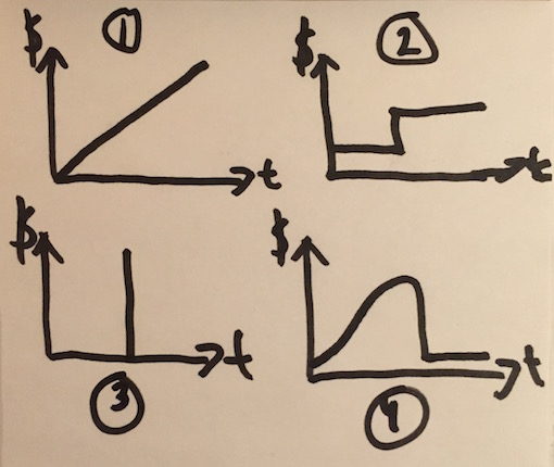
The X-axis always shows time and the Y-axis show impact, illustrated with the $-sign. Y values could be income, cost or number of users, but I’ve used $ to cover them all.
Here’s a short description of each with the headings we created for each:
1. Linear - “the moment we put this into production we will benefit from it. And it just keep on increasing”. Or “every second we wait the cost of not fixing this grows higher and higher”.
This means that we can still reason about how steep this incline is,2 compared to other linear curves. Or if it’s reasonable to wait because of another feature that returns faster, with a steeper still curve.
2. Stair case - “there will be a plateau for awhile and then, at X/X we will see a significant lift”.
The interesting discussion here is of course when, or what, that sudden raise represent. Note that it’s also a period of time where nothing happens. Do we know how long that is? Can we affect it? Can we do other things during that period?
3. Out of business - “there’s a point in time when, if nothing is done, the costs are infinite”.
Example of this is a new law kicking in at a certain date and if we’re not following that law our operating license is withdrawn.3. But still we can reason about when this will happen. Maybe it’s just a quick fix, like changing a text on the insurance letter4. There’s no gain in doing that earlier than needed. There might be other things that we can do and gain from, before that.
4. Cost of delay - “If the Christmas campaign is not released before 18 December you can just forget about until next year”.
There’s much more behind cost of delay, but the diagram simply states that we have a window of opportunity under which this is interesting. If we miss that the whole feature is uninteresting. It, again, gives us something to discuss and use in our prioritization decisions. When does this start? How long is the period? Is it, like the example, increasing in value the longer it’s out there or is it just on/off? When is too early?
The idea is that the impact of each feature is described using one of these diagram. It’s a good starting point for the discussion and, as I’ve given examples of above, useful in order to properly order the features.
Of course, you could allow for empty diagrams too. But I’ve found that it often end up in very complicated things, hard to describe and understand quickly. Selecting from one of these four and explain the reasoning behind it is often enough. And much quicker.
Simpler is better - it's not that complicated
Hypothesis driven development
Somewhat related to the approach above is what Mike Burrows calls hypothesis drive whatever … ah prioritization in our case.
Quite simply; express the feature as an experiment to validate a hypothesis. I’ve blogged about how we did this in the hospital I worked with in Indonesia. In that instance we saw a much deeper understanding and thanks to that easier to prioritize between our initiatives, when we started to view what we did as experiments.
This can be used in conjunction with the diagrams I mentioned above to explain the change we expect to see when implementing the experiment.
A hypothesis is a “falsifiable statement”, if I remember correctly, which means the statement can be proven true or false. Measured if you will. It also means that our initiatives now needs to be expressed as such. “If we remove the CAPTCHA from registration we think that we will see more users register”. Such a statement is crystal clear, easy to measure and even lends itself to A/B testing to evaluate which effort is better.
Summary
For me prioritization has to lot to do with understanding and learning. First of all the goals we are trying to achieve needs to be understood and then a shared understanding needs to be found on the feature level.
In fact, it’s a very valuable side effect of doing the prioritization; shared understanding. Or was it the other way around…?
I’ve found that once that shared understanding is well established among everyone the prioritization is easier and faster to do.