For quite some time I have been working with the management team of Rumah Sakit Bungsu in Bandung. It’s been quite a journey and I’ve learned a lot from doing so.
The last couple of months we have been trying a new approach to get better control in what we do and faster feedback on our actions. A couple of days ago it took flight and the director of the hospital just got it. It was so rewarding to see and hear in action.
In this post I wanted to present the way we are working. Right now I might add. Hopefully we do something else in the future.
Way in the bottom of this post you’ll find an summary should you find it long to read.
The main setup for our team is not very special, we have a huge white board, on wheels that we meet in front of every morning. We like visualizations and metrics and half of the board is dedicated to a bunch of different diagrams and progress indicator. You can read about our “Metrics Pirate Code” in another post.
The other part of the board is a pretty standard task/kanban/scrum board where our “hospital-wide improvements” are made. Somethings that needs attention are “outsourced”, because we want to keep our focus on the overarching, big process-y things.
The task-board simply lists 3 (not more at the time) tasks and our current efforts to improve them. From the beginning we only had these column per item:
- Action - a description of the thing
- PIC - person in charge
- Status - the current status
- To tomorrow - what are we going to work on to get this done
It was a start and it served us well. For awhile. But then …
Discovery through evolution
Since we always have some diagrams on the board, we sometimes saw a disconnect between what we did and what we measured. For example, we track the number of patients served per day, but we working on improving the paint in our ER. How are they related? How can we know if fixing the paint in the ER is really good for us? What do we want to achieve with fixing the paint in ER? Is that contributing to the over all goal of the hospital? What is that now again?
Definition of Done
At this point we stared to add some more columns to our board. The first one we added was Definition of Done. A well-known concept for those that study the noble art of Scrum.
Quite simply as we put a new item on the board we ask:
What would it mean to be Done with this? What does Done look like?
I’ve found that asking this question early raises a lot of really good questions and considerations early. We want that.
Experiment driven
But then we started to do things that we didn’t really know what the Definition of Done was for. For example; we want to increase the number of patients that we serve each day. To what? Well, more… When is that done? Eeeh… soon… ish… What is Done really for this? Done? We never wanna be Done. More is better. Less is worse.
At this point I happened to mention experiments and we tried something out. We cleared the board and stared over with a few new columns:
- What - What are we doing here, what is this thing? A short description
- Why - why are we doing this. We need a good, compelling reason to do something, or we might have other things that are more important.
- Hypothesis - here’s where it get a little bit more interesting. By working on this thing we think that X will happen. We’ll get back to the details around this soon.
- Experiment - the tasks are now rephrased as experiments. This has a huge impact in how failure and learning is perceived. Among other things.
- And an empty column for things like PIC or deadlines as we see fit.
Hypothesis and experiments
For the hypothesis column we made a “rule”1:
The things that we do, should be measured somehow, so that we can know if we’re reaching our goal or not.
This means that we will create some kind of diagram or measurement that we can see our progress through. For example: right now we are trying to increase the number of patients that we serve each day. We have two hypothesis for this:
- Increasing the number of new patients per day will increase the total number of patients per day, over time
- Increasing the number of operations will increase the number of patients. 2
In order to track our progress we created two simple charts; one tracking how many new patients we get per day and another tracking the number of new operations per day.
Sometimes we track more than one thing. The examples above both have bearing on one of our overarching graphs: Number of patients served per day. So in addition to the detailed graph we’re also keeping an eye on the over arching graph. Here’s how that can look:
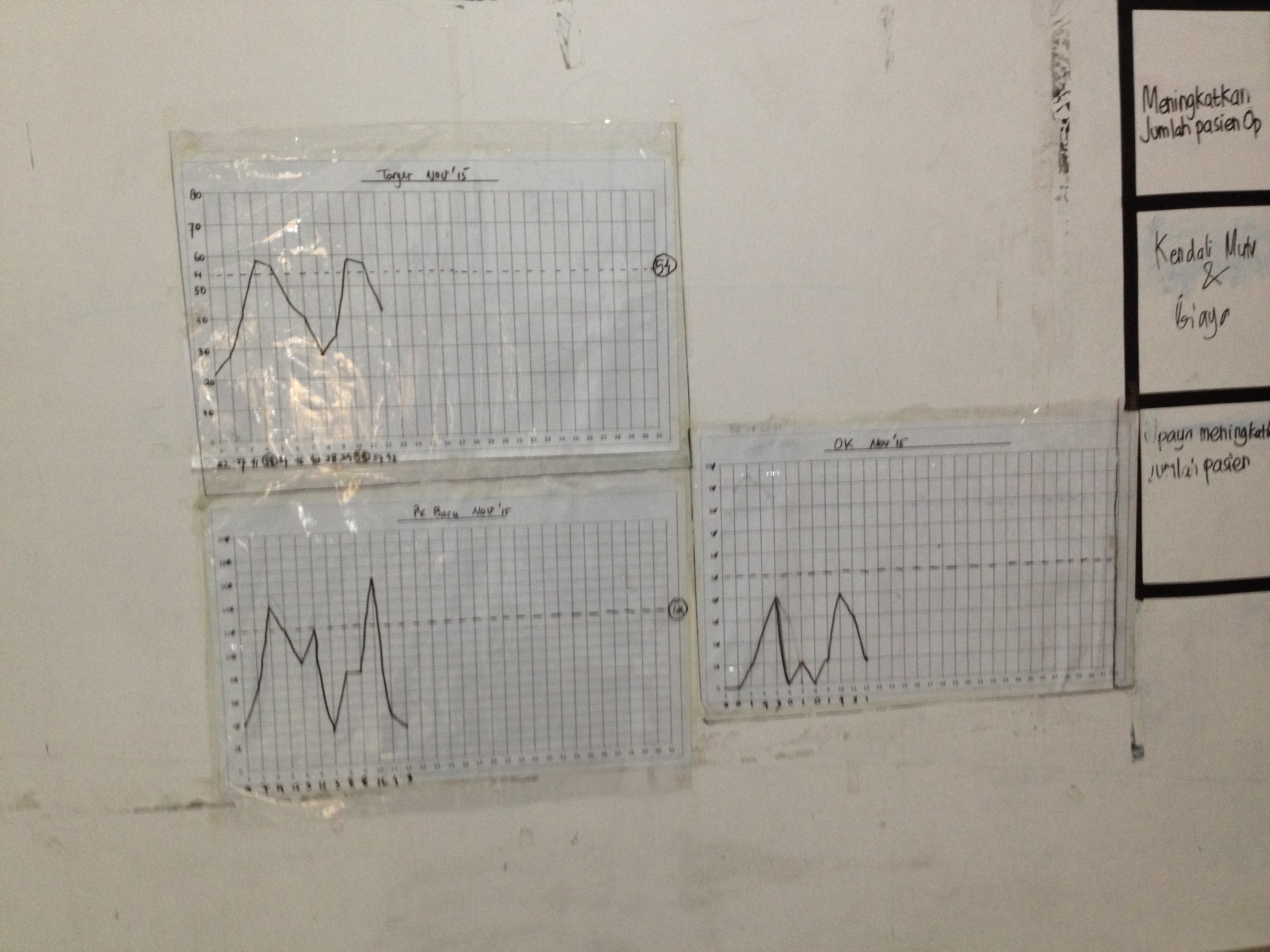
The top left is the number of patients, below that is the number of new patients per day. The last one shows the number of operations per day.
What’s important to track really?
A very interesting, and much too big for this post really, discussion emerged out of us changing our ways into this approach: What are we measuring here?
I’m will write this up in a longer post. Promise. But shortly like this:
For quite some time we have measured only the number of patients we serve per day. There’s nothing wrong with that, it’s a good measure, but it’s really just one aspect of what it’s important in the hospital. Using hospital metaphors it’s a little bit like a doctor just checking you temperature and then decide which kind of medicine you should take.
In order to make better informed decisions we should take more aspects into consideration. I’ve always been attracted to the concept behind Balanced Score cards, we used that to create a few scores that better reflect what we want to go:
- Number of patients - which is money in really.
- Quality - which we express as an indicator using the Net Promoter Score
- Staff satisfaction - a weekly survey checking how the staff enjoy working for us
- Pastoral services - some measurement to see if that we are fulfilling our pastoral ministry too. We are a Salvation Army hospital first and foremost.
There could probably be other, better things to measure. We will find them, as long as we keep improving. The idea behind the word “balancing” is that these should balance against each other. Only trying to get more money will maybe wear the staff out, for example.
Some interesting questions arises:
- What does good look like overall? Probably all the graphs are showing great result
- What should we do now? Well, attend to the aspects that needs our attention. There’s no use bringing in more money if the quality is suffering.
- If we’re doing things that is not contributing to the improvement of any of the aspects in the balanced score card - are we doing the right thing? Or are we measuring the right thing.
Ok - let’s not dwell longer here. Moving on the the experiment column.
Experiments
With the hypothesis in place our experiments (tasks in the Experiment column) now is easier to talk about. Basically we just ask:
What should we try next to improve the metric of this hypothesis?
And then we list a few things, one or two and we try them out for a week or so. Setting the time frame of the experiment is something that is really important but we have not got that into full practice yet.
An experiment should just be a quick thing that we do for awhile. It’s not for ever - that defeats the purpose of the experiments: because the best thing about experiments is that you cannot fail. Or rather failing is also good. Because that’s something we learned and now we move on to the next thing.
For example: let’s say that we think that we try encourage all the temporary doctors in our hospital to do their operations with us. We try that for two weeks.
- If there’s no significant change we can try something else.
- If there’s is a change we can try to turn up the good. What more can we do around this?
One thing that we continuously find good about this is to check back in with the hypothesis:
- Does this experiment contribute / validate the hypothesis?
- How should a success manifest itself on our graph? A failure?
- Is there other, more impact-full experiments we could try.
Yesterday
This is mostly a report about where we are today. It’s not complete. Maybe never will be.
Instead of writing a conclusion I’ll tell you what happened yesterday. Because yesterday my client “got it”.
The hospital director went up to the board and took a look at the graph and said:
“Well, from the last weeks worth of data, we can easily see that our current efforts in trying to increase the number of operations 3 doesn’t pay off”.
She erase the experiments column, and then turn to the management team: “Ok, guys - what should we try now?”
I just stood in the background. Smiling!
Experiment-driven management in action.
Summary
I got some great feedback from my good friend Håkan Forss, about the length and chatty-ness of the post. Any feedback from him is worth listening too. But I also wanted to write the story… So I’d thought I summaries the post here.
Actually I did that already, for the hospital. That’s why I wrote the post, to be able to summaries the ideas behind the how our board is working. To the left you can see the cheat-sheet that we have posted right on our board to remember how it works:
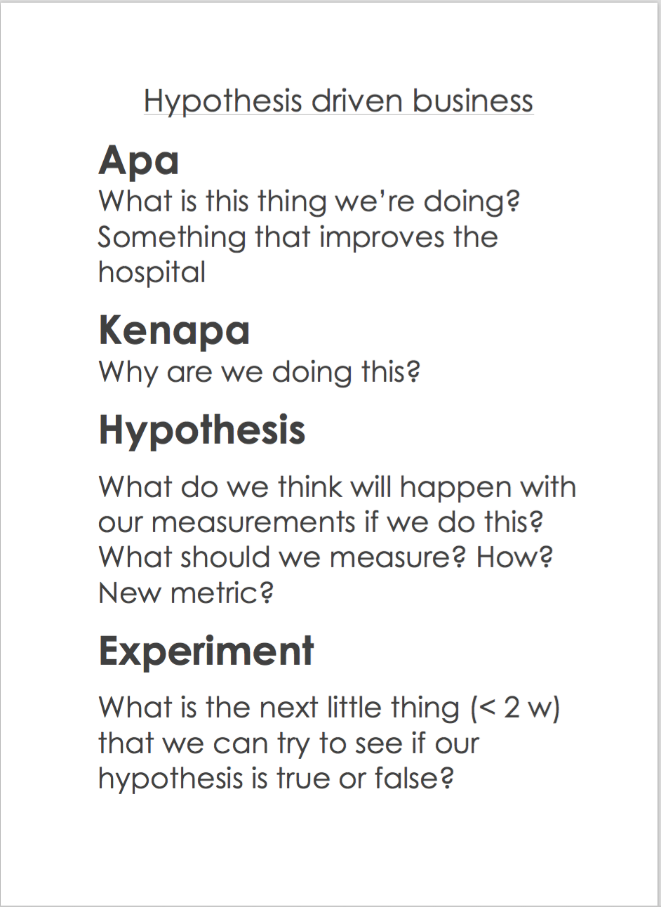
Here’s what it means:
Apa (Indonesian for What) - our description of what we’re trying to do. “Increase the number of patients”, for example
Kenapa (Indonesian for Why) - a short rationale for Why this is important. “We need to serve more patients per day to cover our operational costs”, for example
Hypothesis - What do we think will happen if we take this action? How can we measure that so that we can see our progress? Is there new measurements to be made (follow the Metrics Pirates Code). Examples could be “Increase the number of operations per day will increase the total number of patients served” - this means that we will keep track on the total number of patients served as well as the number of operations. They should both go up.
Experiments - What is the next little thing we can try to see if we are moving in the right direction? What would good look like on our metrics? How would bad look? How can we make that step smaller? We aim to do 2 week experiments before we evaluate and only do 1 or 2 experiments at the time.
-
More like a guideline really… ↩
-
This requires some explanation; we are counting something we call “standard patients” which is just the standard price for one patient in our bed per day. But operations are more expensive. So we count 3 * standard patients per day. Just popping in visiting the doctor is cheaper so we count 1/6 standard patient per day care patient. ↩
-
That graph had flatten out, to almost a stand-still ↩